The New Default. Your hub for building smart, fast, and sustainable AI software
Here at Monterail, we have done tons of research about the current state of IoT market, platforms, devices and technical details. Also, our talented developers started on their own building quick prototypes and ordering some Raspi’s to see how they work in real world.
What we’ve discovered on our way, is that design and UX is one of the most critical parts in any IoT project. I mean, one thing is to collect some cool data from your devices, another is to visualize it and make it accessible for a user.
In this blog post, we will discuss how to merge the design world with IoT to visualize complex real-time data.
Last year we visited IoT Conferences in London and Durham to learn, of course, and to get some new contacts and possibly new projects to develop.
One of the most exciting ones was an application which is used to monitor mammals in Great Britain called MammalWeb.
What’s the idea behind it?
With this app, citizen scientists can set up trap cameras to spot different mammal species near their neighborhood. Not only you can watch them in their environment, but the application also provides invaluable data for real scientists who are investigating mammals behavior. It’s not my jam, to be completely honest, but it brought out some exciting and new (to me) challenges.
The challenges we have encountered
This project was specific. It was directed at people who are more animal enthusiasts than computer geeks, full of statistics and visualizations, and had quite a huge load of data and information. We had to ask three important questions:
How to visualize data effectively?
How to create readable and meaningful diagrams?
How to design unique and useful visualizations based on maps?
MammalWeb project was a good reason to think about building an IoT platform more from the human side. I mean - during brainstorming how new MammalWeb should work - we struggled a lot to create meaningful, user-friendly interface.
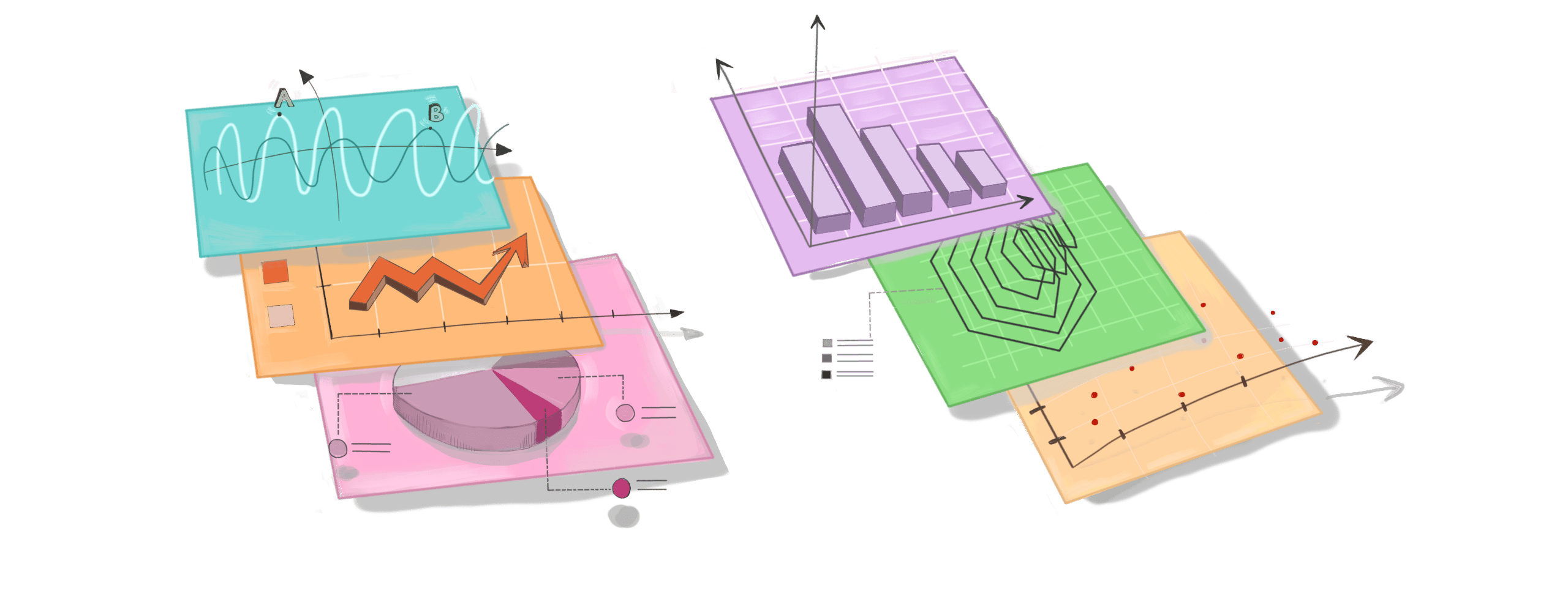
IoT data visualization has to be functional
A chart has to reflect the real face of data and be built as simple as possible to make comparisons and conclusions easier.
As you can see above, here we have two pie charts with some statistics. They look pretty nice on the first look but it is quite difficult to recognize little differences between them. Even if number values are on top of each piece of this chart - this is still a time-consuming exercise to compare both and draw conclusions.
If you still say that it is no problem - let’s check four pie charts and compare them.
I’ve got some good quote for this occasion…
The only worse design than a pie chart is several of them. - Edward Tufte
In that point, as a better idea comes slope-chart. It is *much easier to scan values, notice some trends and generally dependencies or correlations on the chart. You even don’t need to read the axis to understand what this chart means.
It is a natural way to read and understand data by our brain, something is increasing, something is decreasing, all necessary details can be compared.
So, what does it mean to have a functional chart with data visualization?
That means you have to know for what purposes and in which context the chart is used. What advantages and disadvantages charts have and what you actually want to tell other people.
Data visualization has to be beautiful
No matter which target group data visualization is for, you need to deliver high-quality design. Mediocracy is not an option. Many charts have the same issues:
mismatched color palette
overload of graphic elements
wrong type of used diagram
On the other side - many diagrams are also too simple and unremarkable.
Sorry, there is no silver bullet. You just need to analyze, test and see what works best in your case.
When you want to show data in an attractive way, avoid presenting data in dull-tables. Of course, they are useful and super important in organising and processing your data. They can also help you with preparing data for other analyses and reports. However, it is very hard to present main proposals and key results, which can be presented in a more absorbing way.
Visualizations encourage people to stay with your data for a little while and actually get it. Is this one interesting for you in any way?
That’s what I thought. Let’s see how this table could look when we will present data on a map:
It is very important to design visualizations in a simple way without loading distracting elements. Also, keep a good graphic level and avoid complicated, difficult-to-understand patterns.
Data visualization should look attractive but shouldn’t remind you of a Christmas tree.
Data visualization has to be meaningful
People are very curious, but impatient at the same time. They want to get to the clue so they could understand and absorb the knowledge. Everything that we display has to be precise, accurate and valuable because we designers don’t want to (and can’t) waste their time.
I find it especially challenging in IoT projects, which in many cases are based on data. A user must know the context and understand what he looks at. This is a designer’s job to do.
Functional and beautiful chart attributes are important, but one of the crucial things designers have to keep in mind is that visualizations have to be enlightening. They must answer people’s questions, it must teach them and expand their outlook.
The amount of contained data, the general look, functionality, or concluded an answer to a problem - all of these lead to a final effect - a great visualization.
But…
No matter how great your IoT data visualization is - it’s rubbish when you use crappy or incomplete data. If it’s not compelling in any way, don’t feel disappointed if no one glorifies your outstanding design.
Summary
All long hours of research, book reading and designer practice confirms me that: building interfaces for the Internet of Things Industry is demanding and, let's say it, kinda difficult. There are elements that stay more or less the same in every project, but visualizations don’t. Whenever you provide charts to your users - always keep huge attention to what you have to display and in which way. Because misunderstanding your designs may cost quite a lot of money in a real industry IoT system.