The New Default. Your hub for building smart, fast, and sustainable AI software
)
Table of Contents
Vue.js is a growing open-source front-end framework for building single-page applications and user interfaces. Since its first release, Vue.js has been increasing its popularity and gaining new users thanks to its developer-friendly syntax, ease of use, and famously helpful documentation.
In September 2020, the third version of Vue.js was released, and in February 2022, it became the new default version. Vue 3 is smaller, easier to maintain, and has more handy features.
What Has Changed in Vue 3?
Here are some of the new features in Vue 3 which grabbed my attention.

Composition API
One of the Vue.js concepts allows us to create large applications built out of smaller, reusable components. This allows us to easily manage the development process.
In Vue 2 we had three ways to reuse code:
Vue 2 Method 1) Mixins
Advantage:
- Can be organized by feature.
Limitations:
- Conflict-prone: we can end up with some property name conflicts.
- Unclear relationship how they interact.
- Isn't easily reusable in case we want to configure the mixin to be able to use it across other components.
Vue 2 Method 2) Mixin factories
Mixin factories are functions that return a customized version of mixin and give us the possibility to modify such mixin by sending a configuration to it.
Advantage:
- Easily reusable: so we can configure the code and have a more specific relationship of how mixins interact.
Limitations:
- Cannot be dynamically generated because there’s no instance access at runtime.
- Namespacing requires strong conventions.
- They have implicit property additions: we have to look inside the mixin to figure out what properties it exposes.
- Isn't easily reusable in case we want to configure the mixin to be able to use it across other components.
Vue 2 Method 3) Scoped slots
They are special types of slots that work as a reusable template where we can pass data, instead of already-rendered elements.
Advantage:
- Addresses just about every downside of mixins.
Limitations:
- Your configuration ends up in your template, which ideally should contain what we want to render.
- Scoped slots increase indentation in our template, which can decrease readability.
- Exposed properties are only available in the template.
- Since we’re using 3 components instead of 1, it’s a bit less performant.
As you see, we have plenty of options, but each of them has its limitations. Also in Vue 2, we could write components by organizing them only by components options: components, props, data, computed, methods, and lifecycle methods, so during this process, our stand-alone components could get bigger and bigger, and as a result, become less readable and hardly maintainable for future development.
What is Composition API and How It Works
Vue 3 offers us a feature that allows us to organize components by logical concerns — this feature is called Composition API. It’s an optional feature that allows us to write components in another way using more advanced syntax, you have to remember that you can still use the regular one.
Composition API gives the opportunity to reuse code between components.
Vue 2 organizing code with default Options API and reuse code with mixin:
<template>
  <div id="app">
    <div class="content">
      <h1>{ {title} }</h1>
	<label for="title">
	  <input type="text" name="title" v-model="inputVal" />
	</label>
	<button @click="addTitle" class="add-btn">Add</button>
	<button @click="clearInput">Clear</button>
      	<button @click="pressMe">Clear</button>
    </div>
  </div>
</template>

<script>
const exampleMixin = {
  data() {
    return {
      someInfo: "This is our mixin!"
    }
  },
  methods: {
    pressMe() {
      alert(this.someInfo);
    }
  }
}
export default {
  mixins: [exampleMixin],
  data() {
    return {
	inputVal: "",
	title: ""
    };
  },
  methods: {
    clearInput() {
	this.inputVal = "";
    },
    addTitle() {
	this.title = this.inputVal;
    }
  }
};
</script>
As you can see, in the regular syntax our code is organized by component options (data & methods).
Vue 3 organizing code with Composition API:
<template>
  <div id="app">
    <div class="content">
      <h1>{ {title} }</h1>
      <label for="title">
        <input type="text" name="title" v-model="inputVal" />
      </label>
      <button @click="addTitle" class="add-btn">Add</button>
      <button @click="clearInput">Clear</button>
    </div>
  </div>
</template>

<script>


import { ref } from "vue";

export default {
  setup() {
    const inputVal = ref("");
    const title = ref("");

    function clearInput() {
      this.inputVal = "";
    }

    function addTitle() {
      this.title = this.inputVal;
    }

    return { inputVal, title, clearInput, addTitle };
  }
};
</script>
The Composition API is another way that Vue 3 gives us to reuse code. This feature has advantages and limitations.
Advantages:
- Writing less code, easier to pull a feature from your component into a function.
- It builds on your existing skills since you’re already familiar with functions.
- More flexible than Mixins and Scoped Slots
- Intellisense, autocomplete, and typings already work in your code editor.
- Good TypeScript support, so you’ll be able to generate new projects with the latest typeScript versions in Vue 3.
Limitations:
- Requires learning a new low-level API to define composition functions.
Teleport
Earlier called Portal, Teleport allows us to decide under which parent element we can place a piece of HTML code to render. The main advantage of Teleport is that you can place elements anywhere in the DOM tree, so we don’t need to nest components or in some cases split the code into two components.
It accepts a property called “to” in which we can specify where we want to put our elements, the one condition being that the target element should exist before the component has mounted.
So in Vue 3, this should look like this:
<teleport to="#app">
  <div>Foo</div>
</teleport>

<teleport to="#app">
  <div>Bar</div>
</teleport>
will compile to:
<div id="app">
  <div>Foo</div>
  <div>Bar</div>
</div>
You can send elements from multiple sources. Also, we need to remember that the imported elements do not inherit styles.
Teleport is very useful when we work with elements that need to be set in a specific order in the DOM, for instance: modal windows, some kind of alerts, or dialogs.
Some of the components breaking changes
- If we want to define events in a component that this component will emit to its parent, we can use a new option called “emit”, similar to existing props.
- If we want to define an asynchronous component, we should use
defineAsyncComponentfunction:
Vue 2
const asyncComponent = () => import ('./AsyncComponent.vue')Vue 3
const asyncComponent = defineAsyncComponent(() => import ('./AsyncComponent.vue'))Fragments
In Vue 2, we cannot have multiple root elements, this was one of the limitations in the second version and often emit warnings if we tried to create this. Now in Vue 3, we don’t need to wrap root elements in one main element — we can have multiple nodes in the root.
Vue 2
<template>
  <div>
    <header></header>
    <section></section>
  </div>
</template>
Vue 3
<template>
  <header></header>
  <section></section>
</template>
Filters were removed from Vue 3
Filters are no longer supported, instead, we can use computed properties or methods.
Vue 2
<template>
  <div id="app">
    <span>{ {  amount | usd  } }</span>
  </div>
</template>

<script>
  export default {
    data() {
      return {
        amount: 10
      }
    },
    filters: {
      usd(val) {
        return val + '$'

      }
    }
  }
</script>
Vue 3
<template>
  <div id="app">
    <span>{ { usd } }</span>
  </div>
<template>

<script>
export default {
  data() {
    return {
      amount: 10
    }
  },
  computed: {
    usd() {
      return this.amount + '$'
    }
  }
}
</script>
Experimental Suspense feature
Vue 3 allows us to perform lazy loading components with the Suspense component.
The <Suspense> component allows us to provide some fallback content while our user is waiting for the data, so we can see something else for instance spinner or some text.
<Suspense>
  <template #default>
    <!-- component/component which makes an asynchronous call -->
  </template>
  <template #fallback>
    <!-- Content to display when loading -->
    Loading...
  </template>
</Suspense>
Experimental state-driven CSS variables
CSS variables allow us to store a value in one place and then reuse it elsewhere in our CSS code — this is a nice way to have cleaner code.
In Vue 3, a single file component supports v-bind() function in <style> tag, so we can bind a value from the component state to any CSS property. This allows us to dynamically change the value of some CSS properties.
Vue 3
<template>
  <div id="app">
    <div class="content">
       <h1>Hello world!</h1>
       <button @click="modalToggle">Click me</button>
    </div>
    <div v-if="showModal" class="modal">
      <h2>Modal window</h2>
      <button class="close-btn" @click="modalToggle">Close the window</button>
    </div>
    <div class="shadow"></div>
 </div>
</template>

<script>
export default {
  data() {
    return {
      displayShadow: "none",
      showModal: false
    };
  },
  methods: {
    modalToggle() {
      this.showModal = !this.showModal;
      this.displayShadow = this.showModal ? "block" : "none";
    }
  }
};
</script>

<style>
.shadow {
  display: v-bind(displayShadow);
  position: absolute;
  top: 0;
  left: 0;
  width: 100vw;
  height: 100vh;
  background: rgb(46 46 46 / 31%);
  z-index: 10;
  opacity: 1;
}
</style>
In the code above, you can see a simple example of using such a feature. We wanted to show and hide modal window shadow depending on modal is visible or not. So we bound the displayShadow value to the display property of the .shadow class to conditionally change its value in the modalToggle method which is responsible for opening and closing of the modal window.
Single file component <style scoped> changes
If we use scoped styles in SFC, it means that the CSS applies only to this current component. This feature can help developers provide more consistent custom CSS in single file component scoped styles.
- v-bind function is now supported by
<style>tag - Instead of
>>>and/deep/combinators which are deprecated now we can use::v-deep()or its shorter version:deep(). - If we don’t want that slotted component was affected both by parent component styles and child’s scoped styles we can use
::v-slotted()/:slotted()pseudo-element. So in that way child scoped styles do not affect the slot component.
Multiple v-models
In Vue.js we’re using v-model for two-way binding. The most popular way to use it is of course the form elements. In Vue 2, we can use only one v-model in a single component, but Vue 3 allows us to pass multiple v-models to our components by specifying their names. Let’s see how it’ll look.
Vue 2
<template>
  <div id="app">
    <exampleForm v-model="person" />
  </div>
</template>

<script>
export default {
  data() {
    return {
      person: {
        age: 20,
        name: "Jan"
      }
    };
  }
};
</script>
Vue 3
<template>
  <div id="app">
    <exampleForm v-model:age="person.age" v-model:name="person.name" />
  </div>
</template>

<script>
export default {
  data() {
    return {
      person: {
        age: 20,
        name: "Jan"
      }
    };
  }
};
</script>
Lifecycle naming changes
The destroyed lifecycle was renamed to unmounted. The beforeDestroy was changed to beforeUnmount.
Lifecycle methods available in Vue 3:
|
Options API (default) |
Composition API (hook inside setup) |
|
beforeCreate |
Not needed |
|
created |
Not needed |
|
beforeMount |
onBeforeMount |
|
mounted |
onMounted |
|
beforeUpdate |
onBeforeUpdate |
|
updated |
onUpdated |
|
beforeUnmount |
onBeforeUnmount |
|
unmounted |
onUnmounted |
|
errorCaptured |
onErrorCaptured |
|
renderTracked |
onRenderTracked |
|
renderTriggered |
onRenderTriggered |
<template> render changes:
In the new version <template> tag will render its content only if it will have a special directive in it, other than that, it will be treated as a plain HTML element and will render into plain <template> tag.
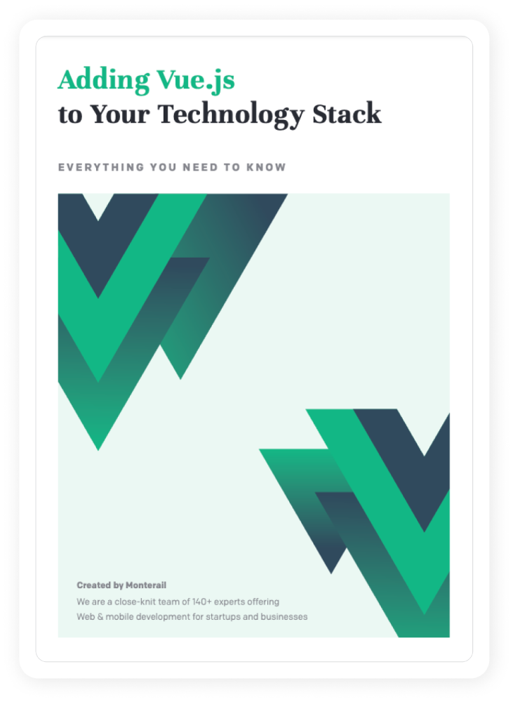
Are you thinking about adding Vue.js to your stack?
Download our comprehensive guide with all the insights, data, and case studies about Vue.js.
Summary
I’ve presented only a small piece of all the changes that Vue offers us in its new version. To learn more, I encourage you to take a look at the Official Vue Docs and of course our newest Vue.js report.
Learn from various Monterail experts on our blog. Monterail is a full-service AI-assisted software development company with 150+ experts. The company delivers custom web and mobile applications for fintech, proptech, healthtech, and eCommerce. Since 2010, Monterail has completed 900+ projects globally. Monterail works with recognized global brands including Bosch, DocPlanner, EY, Merck, and SharkNinja. Monterail was recognized by Deloitte and the Financial Times.