The New Default. Your hub for building smart, fast, and sustainable AI software

Table of Contents
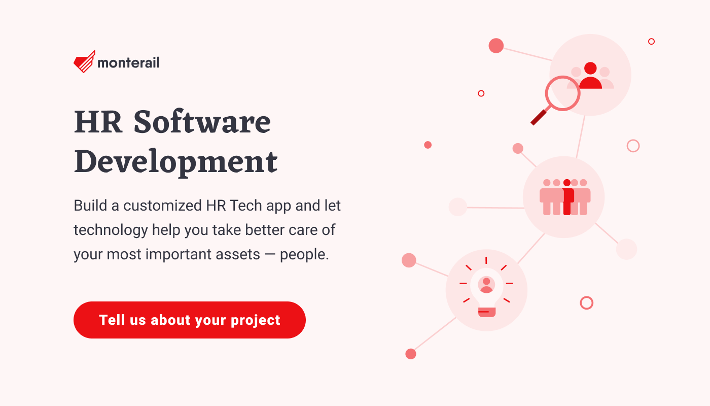
It is universally accepted that HR software design must, naturally, obey the general rules of good app design. Whether large or small, rudimentary or feature-rich, they ought to be clear and easy to use in order to serve their primary purpose—boosting productivity in the workplace.
Most HR applications have to handle multiple users with various access permissions, and deal with data that requires both processing and neat visualization capabilities. After all, companies using those apps usually do so to facilitate the performance of three main groups of tasks:
finding new hires
retaining and motivating employees
keeping track of information in employees' records
When it comes to the first two, it’s important for the software to be highly usable and appealing to the users. Let’s take a closer look at a handful of HR apps we use on a daily basis at Monterail and decided to examine more thoroughly.
The key takeaways from this audit will help you get a grasp of good design practices you should follow when building your HR software. What's more, you'll see how HR app's design can enhance working more effectively as a team and build a better work culture.
1.
I couldn't refrain from mentioning the app that we use on a daily basis at Monterail and showing you the logic behind some of the design details (we've built this app so sorry for the bias!).
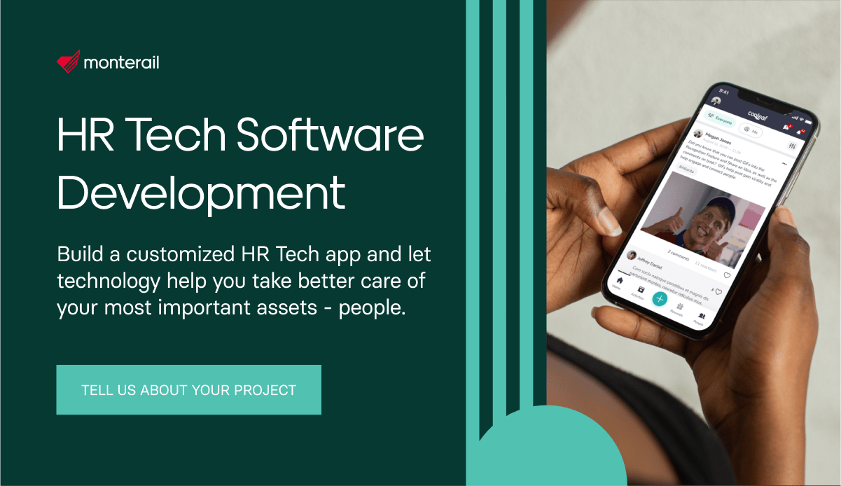
So, Cooleaf is an employee incentive program platform where team members can recognize each other's extraordinary efforts and reward them. The rewards program that can improve productivity in your company and help coworkers become more connected and engaged. Every employee is assigned a monthly pool of points, which they can use to show their coworkers appreciation for certain actions in the workplace, for their support, attitude, or stellar performance.
In other words, as an employee, you can reward anyone in your organization, even add an optional description to explain your reasons, if so inclined. The virtual rewards can then be exchanged for gift cards. The balance resets every month.
It's a great tool for improving the visibility of everyone's contributions to the organization and providing the users with a sense of a shared goal to strive toward by supporting each other. Instant rewards like these (however small) motivate and satisfy employees more than delayed gratification in the form of quarterly bonuses, for example. Also, we tend to see big smiles on our co-workers’ faces each time any of them gets an email with a Cooleaf reward notification :)
The Cooleaf interface design, Source: Cooleaf
The app itself is well-designed and features a minimalist aesthetic, with a lot of white space, which is always good. You can also adjust the app’s color scheme to your liking—at Monterail, we use a red version rather than default green.
Even though its design looks a little bit too basic, it’s far from being so—the Bonusly team managed to pack it with a lot of smart features. For example, you can minimize the main sidebar, for an even more compact look. Not even a single element of UI stayed untouched—there are hover effects on every one of them, which is amazing and handy, especially when it comes to accessibility.
Giving out points/rewards is also a breeze—all you need to do is type out a sum, tag a co-worker and add a short description of the reason for the reward with a hashtag. At Monterail, we use the hashtags to indicate the specific company value reflected in the rewarded activity. To spice things up, you can also add a gif or at least a funny picture to your bonus.
The Cooleaf mobile app
Proper contrast and balance, with just enough white space, and properly set up paddings and margins all make this app a go-to for inspiration when it comes to designing a great UI of a Web app.
Creating recognition post in the Cooleaf app
Key takeaways from Cooleaf’s design framework:
minimal aesthetic/compact look
hover states for every UI element
available as a Web & mobile app (iOS and Android)
lightweight and fast
2.
Harvest is a cross-platform time-tracking tool, available as a standalone app for iOS, Android, macOS, and as a Web tool that can be accessed using every current browser on the market.
If you’re more of an extensions person then Harvest’s got you covered—there’s a Chrome extension, too. Personally, I use it as an app on my MacBook, which is the most convenient way for me. A well-designed, tiny, widget-like time-tracker, it doesn't require much attention and is fitted with a start-stop button and the possibility to manually add some hours at a later time in case you forget to punch the start button. The user experience it provides is just great.
Harvest time-tracking app
And did you notice that there’s a time-related quote on every empty page of the timesheet reports!
The funny face of Harvest—a quote for each day
The app’s design is quite modern and minimalist, which makes it all the more structured, with a visible hierarchy of UI elements and a bright orange accent color. These orange undertones also act as a hidden guide for the user, indicating where to click and pointing out to the most important elements of the app.
The subtle shadows of the pop-up "widget" infuse the app with a little bit of a "wow factor."
Tech-wise, the app is fast, reliable, and it works, also on mobile.
The mobile version is almost identical to its desktop counterpart, developed for macOS. Basic functionalities, including calendar, time-tracking, etc. are always on top, while more advanced features are hidden under the hamburger icon menu. I’m not much of a power user of the mobile version, but it looks fine and works really well. Having said that, both versions of the app mentioned above (the browser-based and the desktop one) do the trick for me just fine.
Just to be clear, though—Harvest isn't just a time-tracker. As a team manager, you can also use it to log expenses and manage invoices on-the-go. You should give a try, even if you're just a one-man army doing freelance work.
Key takeaways:
available as a Web app, mobile app (Android and iOS), and a Chrome extension
minimalist design
clear pop-ups
user-friendly design
3.
Calamari is a piece of HR software designed to assist with employee management and reduce the bureaucratic overhead related to tracking time off and employee attendance. It's not a Swiss army knife, though. Calamari offers you a really simple solution to the above-mentioned needs, and it delivers.
The mobile app has a mere 3.4 in Google Play Store and a better 4.3 rating in the App Store, it works just fine. Personally, I even think that the mobile app has been much more carefully thought out than its web dashboard-ish counterpart.
The browser version could have a better summary (or overview) of your days off, your coworkers’ days off, etc. Don’t get me wrong—it’s there, but hidden quite deep.
One thing that may adversely impact your experience is the application's interface and its huge, bold, solid icons. They are extremely heavy, especially when compared to the rest of the UI, which is on the lighter side, weight- and color-wise. Although the icons look totally out of place on the website, in the mobile version the design looks just about right.
I can see two different approaches that the designers seem to have embraced while designing the app's UX and UI —a more operational one in the browser, and a more analytical one on mobile devices. Take a look at the screenshots below.
The Web version of Calamari—large icons on the homepage vs. proportional calendar view.
The mobile version of Calamari
Key takeaways:
available as a Web app and a mobile application (Android and iOS)
minimalist design
simplicity is a strong key here
user-centered design
really light and pleasant to the eye
Any HR Tech app design advice?
As you can probably tell, simplicity is key to every example I discussed above. It's a good rule to keep in mind when brainstorming or creating proofs-of-concept for any software, especially software created with the purpose of helping an organization grow.
Keep the HR Tech apps usable, minimizing the design as well as the number of features. You can, of course, add nice, fun touches to it, such as gifs or quotes, to make it more approachable and motivate the users to use it, but focus on the core business goal of the application first.
Mobile versions are also always good to have, as employees have become more mobile and often travel or use apps during meetings.
Last but not least, gather feedback. Check with the users, learn what they like or dislike about your product—after all, they’re the ones who use it on a daily basis. Maybe you’ll get lucky and some of them will be UX designers who’ll end up giving you really informative feedback.
It is universally accepted that HR software design must, naturally, obey the general rules of good app design. Whether large or small, rudimentary or feature-rich, they ought to be clear and easy to use in order to serve their primary purpose—boosting productivity in the workplace.
Most HR applications have to handle multiple users with various access permissions, and deal with data that requires both processing and neat visualization capabilities. After all, companies using those apps usually do so to facilitate the performance of three main groups of tasks:
- finding new hires
- retaining and motivating employees
- keeping track of information in employees' records
When it comes to the first two, it’s important for the software to be highly usable and appealing to the users. Let’s take a closer look at a handful of HR apps we use on a daily basis at Monterail and decided to examine more thoroughly.
The key takeaways from this audit will help you get a grasp of good design practices you should follow when building your HR software. What's more, you'll see how HR app's design can enhance working more effectively as a team and build a better work culture.
1. Cooleaf
I couldn't refrain from mentioning the app that we use on a daily basis at Monterail and showing you the logic behind some of the design details (we've built this app so sorry for the bias!).

So, Cooleaf is an employee incentive program platform where team members can recognize each other's extraordinary efforts and reward them. The rewards program that can improve productivity in your company and help coworkers become more connected and engaged. Every employee is assigned a monthly pool of points, which they can use to show their coworkers appreciation for certain actions in the workplace, for their support, attitude, or stellar performance.
In other words, as an employee, you can reward anyone in your organization, even add an optional description to explain your reasons, if so inclined. The virtual rewards can then be exchanged for gift cards. The balance resets every month.
It's a great tool for improving the visibility of everyone's contributions to the organization and providing the users with a sense of a shared goal to strive toward by supporting each other. Instant rewards like these (however small) motivate and satisfy employees more than delayed gratification in the form of quarterly bonuses, for example. Also, we tend to see big smiles on our co-workers’ faces each time any of them gets an email with a Cooleaf reward notification :)

The Cooleaf interface design, Source: Cooleaf
The app itself is well-designed and features a minimalist aesthetic, with a lot of white space, which is always good. You can also adjust the app’s color scheme to your liking—at Monterail, we use a red version rather than default green.
Even though its design looks a little bit too basic, it’s far from being so—the Bonusly team managed to pack it with a lot of smart features. For example, you can minimize the main sidebar, for an even more compact look. Not even a single element of UI stayed untouched—there are hover effects on every one of them, which is amazing and handy, especially when it comes to accessibility.
Giving out points/rewards is also a breeze—all you need to do is type out a sum, tag a co-worker and add a short description of the reason for the reward with a hashtag. At Monterail, we use the hashtags to indicate the specific company value reflected in the rewarded activity. To spice things up, you can also add a gif or at least a funny picture to your bonus.
 The Cooleaf mobile app
Proper contrast and balance, with just enough white space, and properly set up paddings and margins all make this app a go-to for inspiration when it comes to designing a great UI of a Web app.

Creating recognition post in the Cooleaf app
Key takeaways from Cooleaf’s design framework:
- minimal aesthetic/compact look
- hover states for every UI element
- available as a Web & mobile app (iOS and Android)
- lightweight and fast
2. Harvest
Harvest is a cross-platform time-tracking tool, available as a standalone app for iOS, Android, macOS, and as a Web tool that can be accessed using every current browser on the market.
If you’re more of an extensions person then Harvest’s got you covered—there’s a Chrome extension, too. Personally, I use it as an app on my MacBook, which is the most convenient way for me. A well-designed, tiny, widget-like time-tracker, it doesn't require much attention and is fitted with a start-stop button and the possibility to manually add some hours at a later time in case you forget to punch the start button. The user experience it provides is just great.

Harvest time-tracking app
And did you notice that there’s a time-related quote on every empty page of the timesheet reports!

The funny face of Harvest—a quote for each day
The app’s design is quite modern and minimalist, which makes it all the more structured, with a visible hierarchy of UI elements and a bright orange accent color. These orange undertones also act as a hidden guide for the user, indicating where to click and pointing out to the most important elements of the app.
The subtle shadows of the pop-up "widget" infuse the app with a little bit of a "wow factor."
Tech-wise, the app is fast, reliable, and it works, also on mobile.
The mobile version is almost identical to its desktop counterpart, developed for macOS. Basic functionalities, including calendar, time-tracking, etc. are always on top, while more advanced features are hidden under the hamburger icon menu. I’m not much of a power user of the mobile version, but it looks fine and works really well. Having said that, both versions of the app mentioned above (the browser-based and the desktop one) do the trick for me just fine.
Just to be clear, though—Harvest isn't just a time-tracker. As a team manager, you can also use it to log expenses and manage invoices on-the-go. You should give a try, even if you're just a one-man army doing freelance work.
Key takeaways:
- available as a Web app, mobile app (Android and iOS), and a Chrome extension
- minimalist design
- clear pop-ups
- user-friendly design
3. Calamari
Calamari is a piece of HR software designed to assist with employee management and reduce the bureaucratic overhead related to tracking time off and employee attendance. It's not a Swiss army knife, though. Calamari offers you a really simple solution to the above-mentioned needs, and it delivers.
The mobile app has a mere 3.4 in Google Play Store and a better 4.3 rating in the App Store, it works just fine. Personally, I even think that the mobile app has been much more carefully thought out than its web dashboard-ish counterpart.
The browser version could have a better summary (or overview) of your days off, your coworkers’ days off, etc. Don’t get me wrong—it’s there, but hidden quite deep.
One thing that may adversely impact your experience is the application's interface and its huge, bold, solid icons. They are extremely heavy, especially when compared to the rest of the UI, which is on the lighter side, weight- and color-wise. Although the icons look totally out of place on the website, in the mobile version the design looks just about right.
I can see two different approaches that the designers seem to have embraced while designing the app's UX and UI —a more operational one in the browser, and a more analytical one on mobile devices. Take a look at the screenshots below.


The Web version of Calamari—large icons on the homepage vs. proportional calendar view.

The mobile version of Calamari
Key takeaways:
- available as a Web app and a mobile application (Android and iOS)
- minimalist design
- simplicity is a strong key here
- user-centered design
- really light and pleasant to the eye
Any HR Tech app design advice?
As you can probably tell, simplicity is key to every example I discussed above. It's a good rule to keep in mind when brainstorming or creating proofs-of-concept for any software, especially software created with the purpose of helping an organization grow.
Keep the HR Tech apps usable, minimizing the design as well as the number of features. You can, of course, add nice, fun touches to it, such as gifs or quotes, to make it more approachable and motivate the users to use it, but focus on the core business goal of the application first.
Mobile versions are also always good to have, as employees have become more mobile and often travel or use apps during meetings.
Last but not least, gather feedback. Check with the users, learn what they like or dislike about your product—after all, they’re the ones who use it on a daily basis. Maybe you’ll get lucky and some of them will be UX designers who’ll end up giving you really informative feedback.
Bartosz Andrzejewski
Product Designer