The New Default. Your hub for building smart, fast, and sustainable AI software
Design Systems
Design systems are collections of reusable components and design tokens, documented together with the rules for using them, that give every team working on a product one shared source for how its interface looks and behaves.
What Are Design Systems?
A design system exists so that the fortieth screen a company ships costs less to build than the fourth, and still looks like it came from the same product. It does that by turning design decisions into assets teams reuse instead of recreating.
A mature design system has layers. Design tokens store the base decisions, such as colors, type sizes, spacing, and corner radii, as named values. Components such as buttons and date pickers turn those values into working code and matching design-tool assets. Patterns combine components into answers for recurring problems, such as a sign-up flow or an empty state. Guidelines explain when to use each piece and when not to.
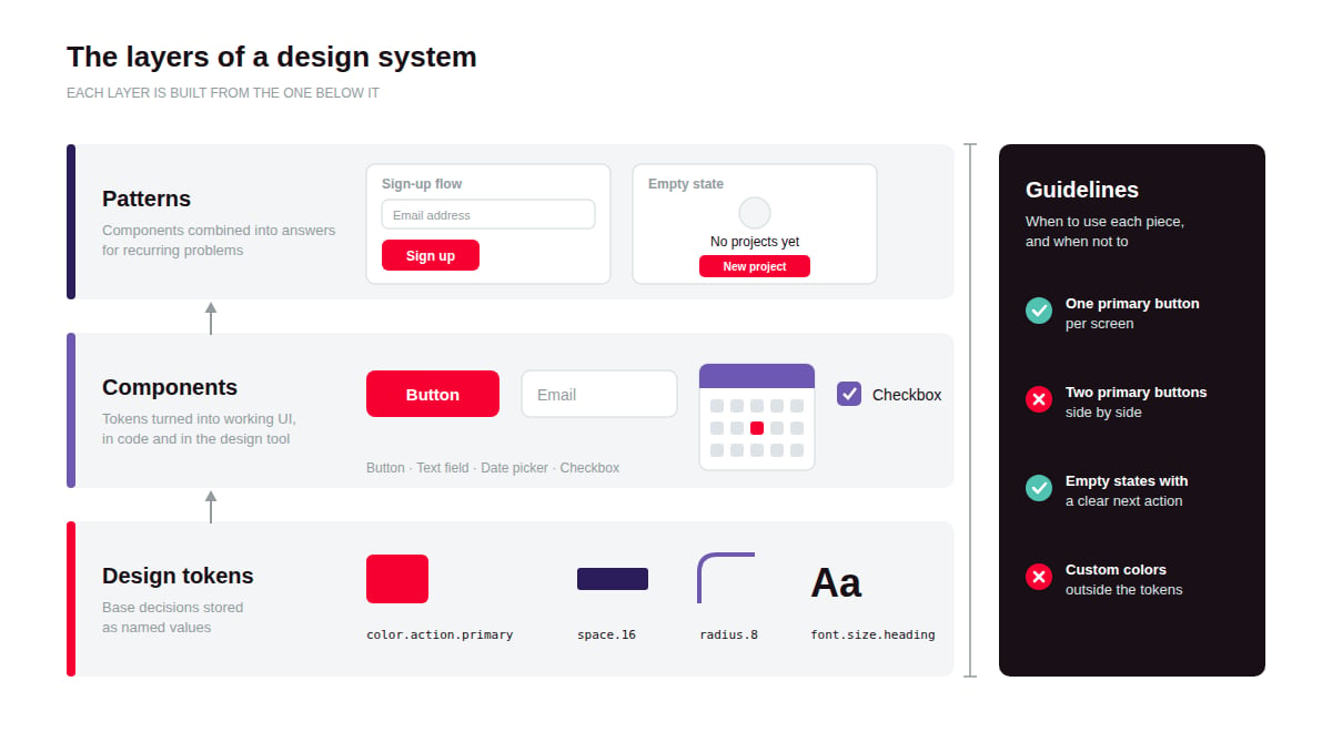
Public examples show the range. Google's Material Design, IBM's Carbon, Shopify's Polaris, and the GOV.UK Design System are all public, so anyone can study how they are built, from token values to usage guidelines.
Why Do Design Systems Matter?
Design systems matter because interface inconsistency grows with every team and screen added, and cleaning it up later costs more than preventing it.
Inconsistency compounds with scale. Without shared components, five teams build five date pickers, each with its own bugs and accessibility gaps. Users notice the differences, and every fix has to be made five times.
One company often runs several products. Customers moving between a web app and a mobile app expect them to feel like one brand. A shared system is the practical way to deliver that without central review of every screen.
AI-assisted development needs clear building blocks. Coding assistants tend to produce more consistent UI when they can reuse documented components and tokens instead of inventing styles on the spot.
How Do Design Systems Work?
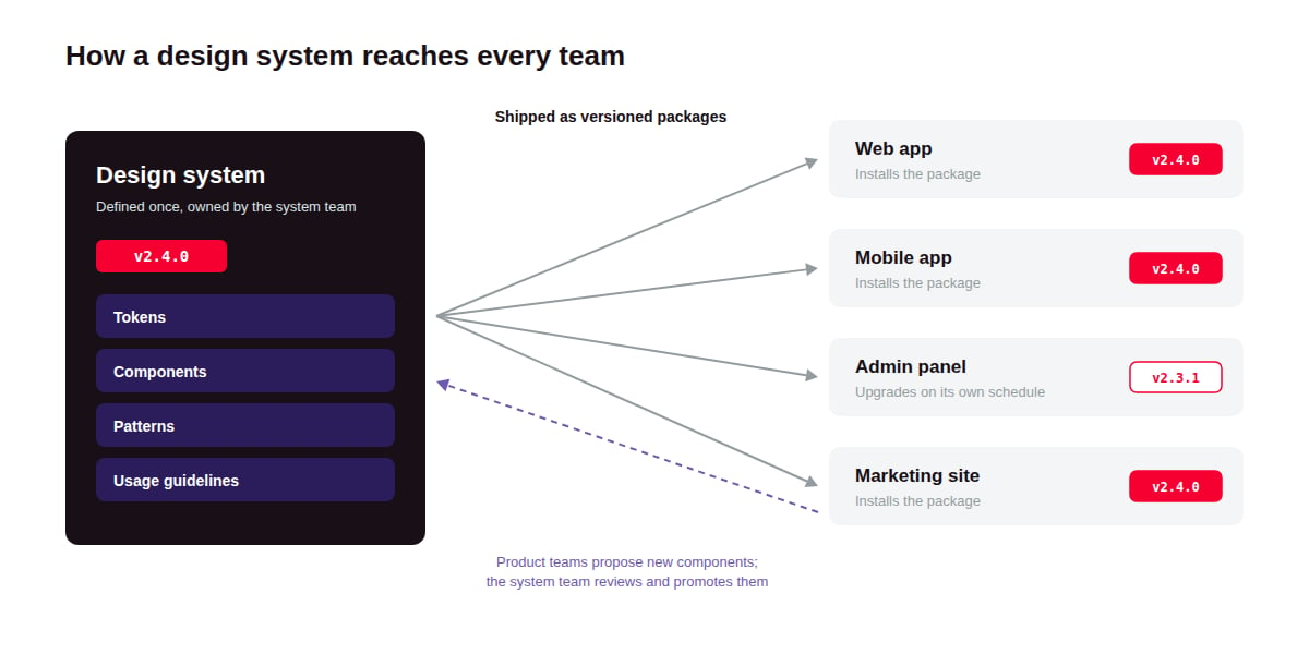
A design system works by capturing design decisions once, as tokens and components, and distributing them to every team as versioned packages they install instead of copying.
Audit what exists. Inventory the UI already in production, for example by collecting every button variant across the product. The audit shows where duplication is worst and where the system should start.
Define tokens. Base decisions become named values such as color.action.primary, stored in a format tools can read. The W3C Design Tokens Community Group published the first stable version of its shared token format in October 2025, giving tools a common format to adopt instead of each inventing its own.
Build components in design and code. Each component exists twice, as a design-tool component and as coded UI, with matching names and states. Many teams organize them from small to large using Brad Frost's Atomic Design model.
Document usage. Every component gets a page with its variants, dos and don'ts, accessibility notes, and code examples, so teams can use it without asking the system team.
Version and distribute. Components ship as packages with semantic version numbers. Product teams upgrade on their own schedule, and breaking changes are announced instead of discovered.
Govern contributions. A contribution process defines how product teams propose new components and who reviews them. Many systems use a tiered model: a team builds a one-off component locally first, and the system team promotes it once other teams need it too.
What Tools Do Teams Use for Design Systems?
Most design systems live in two places at once, a design tool and a code repository, with a documentation site connecting them.
Where Do Designers Build Design System Components?
Figma and Penpot are the main design tools for system work. Figma's variables and shared libraries let a system team publish updates that each product file can review and accept. Penpot is an open-source alternative with native support for design tokens.
Where Do Developers Build Components and Tokens?
Storybook is a widely used workshop for developing components in isolation, with each state documented as a story. Style Dictionary transforms token files into the formats each platform needs, such as CSS variables or iOS and Android resources.
Where Do Teams Document Design Systems?
zeroheight and Supernova host design system documentation sites that pull live content from Figma and code repositories, so embedded examples stay current when components change. Supernova also automates token pipelines from design to code.
What Are the Key Characteristics of Design Systems?
Design systems are defined by being shared and maintained: a set of assets only counts as a system when many teams use it and someone keeps it current.
Single source of truth. Each component has one definition. Product teams consume it as a dependency instead of copying and modifying it.
Theming through tokens. Because components read their colors and spacing from tokens, swapping the token set changes the look everywhere. The same components can support dark mode or several white-label brands.
Opinionated defaults. A system makes choices so product teams do not have to, such as one primary button style and one way to show errors. Fewer choices per screen is the point, not a limitation.
Run as a product. A design system has users (the designers and developers who build with it), a roadmap, releases, and a support channel. Treating it as a side project is a common reason systems stall.
Platform-spanning. Shared tokens let one system serve both web and native mobile apps, even when each platform has its own component code.
What Are the Benefits of Design Systems?
The main benefit of a design system is speed without drift: teams ship new screens faster while the product stays consistent.
Faster feature delivery. Teams assemble screens from tested components instead of building each element from scratch, and design reviews focus on the flow instead of pixel details.
Consistent user experience. When the same action always looks and behaves the same way, users learn the product once instead of screen by screen.
Fewer accessibility defects. An accessibility fix made in one component reaches every screen that uses it with the next upgrade.
Smoother design-to-development handoff. Designers and developers use the same component names and properties, so specs need less explaining.
Faster onboarding. New designers and engineers learn one documented system instead of reverse-engineering conventions from old screens.
What Are the Challenges of Design Systems?
The main challenge of design systems is that they cost the most before they pay off, and they only pay off if teams choose to use them.
High upfront cost. A first usable version usually needs a dedicated team for several months, and the payoff arrives only once several teams adopt it. Starting smaller, with tokens and the most-used components, cuts the cost but delays the consistency gains.
Adoption is not automatic. Teams with deadlines keep their local components. Mandating the system gets compliance quickly, but it also breeds workarounds when the system lacks what teams need.
Flexibility and consistency pull in opposite directions. A strict system keeps the product coherent but pushes teams with unusual needs to fork it. A loose one keeps teams happy while the product drifts.
Upgrades carry a cost. Every breaking change forces product teams to schedule migration work. Supporting old versions longer eases that, at the cost of the system team maintaining several versions at once.
Design files and code drift apart. Keeping Figma components and coded components in sync takes discipline or automation. Automated token pipelines reduce drift, but they add infrastructure someone has to own.
What Is the Difference Between a Design System and a Component Library?
A component library is a set of coded UI components, while a design system wraps components in tokens and usage rules so they work as one shared standard across teams.
Design system | Component library | |
What it contains | Tokens, components, patterns, usage guidelines, contribution rules | Coded UI components and their API documentation |
Covers design files | Yes, with matching components in design and code | Usually code only |
Explains when to use each part | Yes, through guidelines and patterns | Rarely, beyond API documentation |
Scope | A whole product experience, often across platforms | Usually one framework or platform |
Examples | Material Design, Carbon, Polaris | MUI, Radix UI, shadcn/ui |
FAQ about Design System
Related Terms
Need expert help with Design Systems?
Monterail builds custom software solutions that leverage the latest technologies. Let's discuss how we can help with your project.
GET IN TOUCHGET IN TOUCH