The New Default. Your hub for building smart, fast, and sustainable AI software
Visual Design
Visual design is the discipline of shaping how digital products and the sites around them look, using typography, color, layout, spacing, imagery, and iconography to create a consistent visual language across every screen.
What Is Visual Design?
Visual design decides what a user notices first on a screen and whether the product looks credible enough to keep using. Before anyone reads a label or clicks a button, the layout has already told them where to look and roughly what kind of product this is.
In software, visual design covers the look of product interfaces and the marketing sites around them. It works through a small set of levers: type size and weight, color and contrast, spacing, alignment, imagery, and icons. Each lever changes how quickly a user can scan a page and pick out what matters.
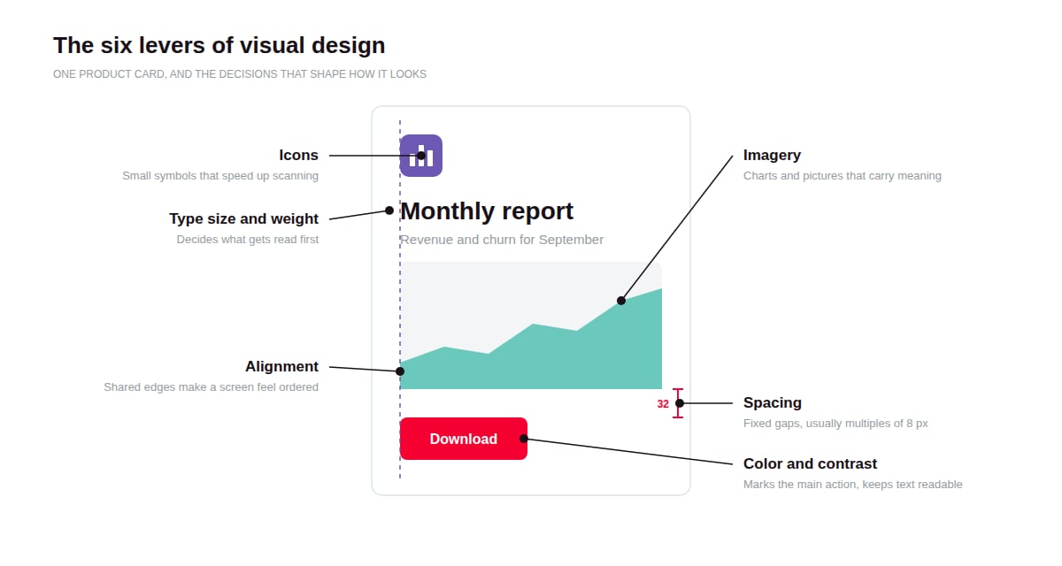
Most of the work is systematic. A visual designer defines a type scale, a color palette with fixed roles, spacing rules, and a layout grid once, then applies them everywhere. That is what makes a dashboard built this quarter look like it belongs to the same product as a settings page built two years ago.
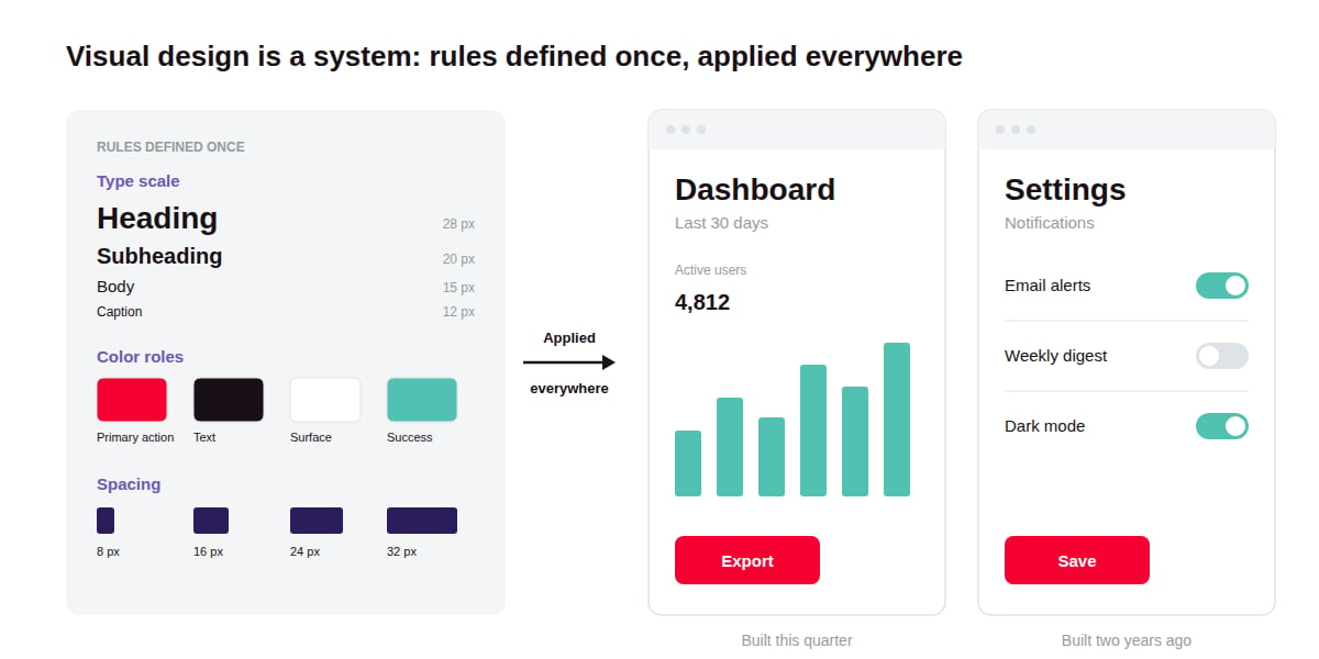
Visual design sits next to UI design, and on small teams one person often does both. In practice, a visual designer decides that the primary button is filled and uses the brand color, while a UI designer decides where that button sits and what happens after it is clicked.
Why Does Visual Design Matter?
Visual design matters because users judge a product by how it looks long before they can judge how well it works, and that first judgment colors everything after it.
It sets the reading order. Size, weight, contrast, and position tell the eye where to go first. When hierarchy is clear, a user finds the one number that matters on a dashboard in seconds. When it is flat, every element competes and the user has to read everything.
It shapes perceived quality. Studies of ATM interfaces in Japan and Israel in the 1990s found that people judged better-looking layouts as easier to use before trying them, even though every layout offered the same functions. A polished product earns patience with its rough edges; an inconsistent one makes users suspect deeper problems.
It decides who can use the product. Low-contrast text and meaning carried by color alone lock out users with low vision or color blindness. These are visual design decisions, made or missed at the style level.
It carries the brand into daily use. Marketing sets expectations about what a company is like. The product is where customers spend their time, so visual design is where those expectations are confirmed or broken.
How Does Visual Design Work?
Visual design works by turning brand and content priorities into a small set of reusable rules for type, color, spacing, and layout, then applying those rules consistently across every screen.
Start from content and brand. The designer first establishes what each screen needs to communicate and which brand attributes the product should express. A data-heavy analytics tool and a consumer wellness app call for very different density and tone before a single color is picked.
Establish hierarchy. Each screen gets one clear primary element, with everything else ranked below it. Designers use size, weight, color, and whitespace to create that order, and check it by blurring the screen to see which elements still stand out.
Define a type scale. Instead of choosing font sizes screen by screen, the team sets a fixed ladder of sizes and weights, each with a named role such as heading or caption. This keeps text consistent and makes responsive scaling predictable.
Build a color system with roles. Colors are assigned jobs (primary action, surface, text, success, warning, error) instead of being used freely. Each pairing is checked against contrast requirements, and dark mode gets its own tested values, since inverted colors rarely hold up.
Set spacing and layout rules. Most teams use a base spacing unit, commonly 8 pixels, and multiples of it for padding and gaps, plus a column grid for layout. Consistent spacing is one of the cheapest ways to make a product look polished.
Codify and test. As the product grows, the rules become design tokens and components in a design system, so developers use the same values designers do. Designs are then checked with production content, on small screens, at 200% zoom, and in dark mode, where most visual problems surface.
What Tools Do Teams Use for Visual Design?
Most teams create visual designs in a canvas tool and manage the resulting style values as design tokens, with accessibility checkers testing the output along the way.
Which Canvas Tools Do Designers Work In?
Figma, Penpot, and Sketch are the main canvas tools for interface work. Figma is the default for many product teams. Penpot is an open-source, browser-based alternative with native design token support, while Sketch remains a Mac-only option with a long-standing user base. All of them support shared styles and component libraries.
Which Tools Keep Visual Styles Consistent in Code?
Tokens Studio and Style Dictionary manage design tokens: named values for colors, type sizes, spacing, and radii. Tokens Studio is a Figma plugin for defining and editing tokens, and its team also helped build Penpot's native token feature. Style Dictionary transforms token files into the formats each platform needs, such as CSS variables or iOS and Android resources.
Which Tools Check Visual Design for Accessibility?
Stark and the WebAIM Contrast Checker test color pairings against WCAG contrast requirements. Stark runs as a plugin inside design tools, so problems get caught before handoff, while the WebAIM checker is a quick browser-based check for any two colors.
What Are the Key Characteristics of Visual Design?
Good visual design in software is systematic: it runs on a limited set of rules applied everywhere, instead of styling decisions made fresh for each screen.
Visual affordance. Elements look like what they do. Buttons look pressable and disabled controls look inactive, so users can predict behavior before they click.
Consistency across screens. The same element looks the same wherever it appears. A button or an error message that changes style between pages forces users to relearn the product.
Restraint. A limited palette and usually one or two typefaces keep emphasis meaningful. When everything is bold or colorful, nothing stands out.
Accessible by default. Contrast ratios and minimum type sizes are written into the rules, so every new screen inherits them without an audit of its own.
Responsive behavior. Visual rules define how a layout adapts from a narrow phone screen to a wide monitor. Spacing and column counts shift at set breakpoints, so no device needs its own redesign.
What Are the Benefits of Investing in Visual Design?
Investing in visual design pays off mainly by making a product faster to understand and cheaper to extend, since each new screen reuses rules that already work.
Cheaper UI development. With tokens and a type scale in place, developers stop making styling decisions on every ticket. Design reviews for new features can focus on the flow instead of pixel-level debates.
Faster rebrands and theming. When colors and type live in tokens, a rebrand or a white-label version for a client changes values in one place, not on every screen.
Lower accessibility cost. Contrast and type rules set early avoid retrofitting later, when changing one brand color means re-checking every screen that uses it.
One brand across platforms. Web and mobile apps built from the same token set look like one product, even when separate teams build them.
What Are the Challenges of Investing in Visual Design?
The main challenge of investing in visual design is that its quality is easy to see and hard to measure, which leaves it open to taste debates and budget cuts.
Taste debates slow reviews. Stakeholders often argue from personal preference. Tying decisions to stated principles and user testing settles more of them, but testing adds time, and preference tests rarely produce a clear winner.
Consistency limits expression. A strict system keeps the product coherent, but it can make launches and campaign pages look interchangeable. Allowing exceptions brings personality back, at the cost of the drift the system was built to prevent.
Accessibility can clash with brand colors. A bright brand color often fails the 4.5:1 contrast ratio for text on white. Darker shades fix the contrast but move the product away from the brand guidelines, which usually needs sign-off from whoever owns the brand.
Maintenance never ends. Tokens and components need an owner. Without governance, one-off variations creep back in; with it, a designer's time goes to reviewing contributions instead of new work.
Mockups drift from production. Polished mockups tend to use ideal content, such as short names and round numbers. Production data brings long names and empty states that break layouts. Designing with production content catches this early, but it takes longer to set up.
What Is the Difference Between Visual Design and UI Design?
Visual design decides how a product looks, while UI design decides how its controls are arranged and operated; the two overlap on every screen but answer different questions.
Visual design | UI design | |
Main question | How should the product look? | How does a user operate the product? |
Core decisions | Typography, color, spacing, layout grid, imagery, iconography, the look of each component state | Placement of controls, navigation structure, input patterns, which states each component needs |
Applies beyond interfaces | Yes, including brand assets such as illustrations and social graphics | No, it covers interfaces only, from product screens to marketing sites |
Typical deliverables | Style guides, type scales, color systems, high-fidelity mockups | Wireframes, component specs, screen flows, interactive prototypes |
How success is judged | Clarity, consistency, brand fit, accessible contrast | Task completion, error rates, speed, learnability |
FAQ about Visual Design
Need expert help with Visual Design?
Monterail builds custom software solutions that leverage the latest technologies. Let's discuss how we can help with your project.
GET IN TOUCHGET IN TOUCH