The New Default. Your hub for building smart, fast, and sustainable AI software
Responsiveness
Responsiveness is an interface's ability to rearrange its layout to fit whatever space it is given, from a narrow phone to a wide desktop monitor.
What Is Responsiveness?
A product team rarely knows which screen its next user will open the product on, and responsiveness is how a single codebase handles that uncertainty. Instead of maintaining separate mobile and desktop sites, a responsive interface uses one set of HTML and CSS that reflows as the available width changes.
In practice, a three-column dashboard on a laptop becomes a single stacked column on a phone, and the navigation collapses behind a menu button. The content stays the same. Only its arrangement changes.
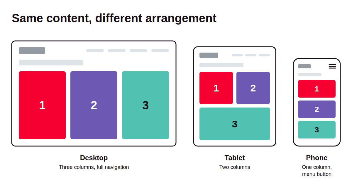
The approach has a clear origin. Ethan Marcotte named it in a 2010 A List Apart article and defined it through three ingredients: fluid grids, flexible images, and media queries. Those foundations still hold, with newer CSS features such as container queries built on top.
The word has a second meaning in UX: how quickly an interface reacts to a tap or click. This entry covers layout responsiveness. Input speed is a performance topic, touched on in the FAQ below.
Why Does Responsiveness Matter for Digital Products?
Responsiveness affects how a product ranks in search and whether it meets accessibility standards, because both now judge a site by how it behaves in a narrow viewport.
Search rankings are based on the mobile version. Google finished moving all sites to mobile-first indexing in July 2024, so it crawls and ranks pages using what its smartphone crawler sees. A desktop page that breaks on a phone is judged by the broken version.
Accessibility standards require content to reflow. WCAG 2.1 success criterion 1.4.10 (Reflow, Level AA) asks that content work at a width of 320 CSS pixels without scrolling in two directions. That width matches what a desktop user sees at 400% browser zoom, so the rule protects people with low vision as well as phone users. In the EU, the European Accessibility Act has applied since June 2025, and its harmonized standard, EN 301 549, incorporates WCAG 2.1 Level AA.
How Does Responsiveness Work?
A responsive interface combines flexible layout units with conditional CSS rules, so the browser can recalculate the layout for any width it is given.
Fluid grids. Layout widths are set in relative units, such as percentages or the CSS Grid fr unit, instead of fixed pixels. Columns stretch and shrink with the window, so the layout holds together at widths nobody designed for explicitly.
Media queries and breakpoints. A media query applies a block of CSS only when a condition is met, most often a minimum or maximum viewport width. The widths where the layout changes shape are called breakpoints. They work best where the content starts to look cramped, instead of at the exact width of a popular phone, because device sizes change every year.
Flexible media. Images and video scale within their containers instead of overflowing them. Responsive image markup (the srcset attribute and the picture element) lets the browser download a smaller file on a small screen, so a phone on mobile data does not pull a 2,400-pixel hero image.
Container queries. Newer CSS lets a component respond to the width of its own container instead of the whole viewport. A product card can switch from a horizontal to a stacked layout depending on whether it sits in a wide main column or a narrow sidebar. This suits component-based design systems better than page-level breakpoints do.
The viewport meta tag. Mobile browsers assume a page was built for desktop and zoom it out unless told otherwise. The tag width=device-width tells them to render at the device's own width, which is what lets every other technique take effect on phones.
What Tools Do Teams Use to Build and Test Responsive Interfaces?
Teams use design tools to define resizing behavior before code exists, then preview browsers and device clouds to check the result.
Design tools with layout constraints. Figma, Framer, and Webflow let designers define how frames and components resize, and preview a layout at several widths before development starts.
Multi-viewport preview browsers. Chrome DevTools device mode emulates screen sizes and touch input for a single viewport. Polypane and Responsively App show the same page at several widths side by side, with scrolling and interactions mirrored across all of them.
Physical-device testing clouds. Emulation misses problems like on-screen keyboards covering form fields or browser toolbars resizing the viewport mid-scroll. BrowserStack, Sauce Labs, and TestMu AI (formerly LambdaTest) give teams remote access to physical phones and tablets.
What Are the Key Characteristics of a Responsive Interface?
A well-built responsive interface can be recognized by a handful of properties that hold at any width, from how text wraps to how buttons respond to touch.
Content parity across widths. Phone users get the same information and features as desktop users, arranged differently. Cutting content from the mobile version to make a layout fit is a common shortcut, and Google warns that sites doing this can expect to lose traffic under mobile-first indexing. Moving content into tabs or accordions is fine, as long as it is still on the page.
No horizontal scrolling for body content. Text and controls fit the viewport width at any size. Data tables and maps are accepted exceptions, since WCAG's reflow criterion excludes content that needs a two-dimensional layout to make sense.
Touch-friendly targets. Buttons and links are large enough to tap accurately. WCAG 2.2 sets a minimum of 24 by 24 CSS pixels at Level AA (success criterion 2.5.8), and Apple's Human Interface Guidelines recommend 44 by 44 points.
Readable type at every size. Text scales with the screen, often through the CSS clamp() function, so headlines do not overflow a phone or look tiny on a wide monitor. Line length stays short enough to read comfortably.
Interactions that do not depend on hover. Dropdown menus and tooltips that open on hover have no trigger on a touchscreen. Responsive interfaces give every hover behavior a tap or keyboard equivalent.
What Are the Benefits of Designing for Responsiveness?
Designing for responsiveness lets one product serve every screen size with a single codebase, which lowers cost and keeps the experience consistent.
Wider reach from one build. A single product serves phones, tablets, laptops, and large monitors, including screen sizes that did not exist at launch, such as foldables.
Lower maintenance cost and faster releases. Separate mobile sites (the old "m-dot" pattern) meant every feature shipped twice and content drifted between versions. With one responsive codebase, a change to a component ships everywhere at once.
A consistent experience across devices. Users who start a task on a phone and finish it on a laptop find the same navigation and features in the same places, so they do not relearn the product on each device.
Fewer abandoned sessions on small screens. Users who hit unreadable text or have to scroll sideways tend to leave. A layout that fits removes those reasons to quit before the task is done.
What Are the Challenges of Designing for Responsiveness?
The main challenges of designing for responsiveness are a larger testing surface and complex screens that have no obvious small-screen form, and each fix adds cost somewhere else.
The testing surface multiplies. Every screen now needs checking at several widths and in both orientations. Visual regression tools such as Percy and Chromatic catch layout breaks automatically, but every added width adds snapshots to review and pay for. Most teams settle on a small set of widths and accept some risk in between.
Complex screens do not shrink gracefully. Dense dashboards and wide data tables have no natural phone layout. Teams can stack table rows into cards or hide secondary columns behind a toggle, but stacked cards lose side-by-side comparison, and hidden columns bury data that mobile users may need.
Most code ships to every device. Responsive images solve the problem for media, but JavaScript and CSS usually ship in full to every screen. Trimming them per device means conditional loading, which adds build complexity and more cases to test.
Design effort moves up front. Designers have to specify behavior between breakpoints, not only at them. Handing off one phone mockup and one desktop mockup leaves developers guessing at every width in between. Designing with components and resizing constraints closes that gap, at the cost of slower early design work.
What Is the Difference Between Responsive and Adaptive Design?
Responsive design reflows one fluid layout continuously as the screen changes, while adaptive design switches between a fixed set of layouts built for specific width ranges.
Responsive design | Adaptive design | |
|---|---|---|
Layout behavior | Reflows continuously as width changes | Jumps between a fixed set of predefined layouts |
What triggers a change | CSS rules evaluated in the browser | Detected screen width or device type, in the browser or on the server |
Widths between targets | Handled by the fluid grid | Get the nearest predefined layout, which can leave empty margins |
Design deliverable | Rules for behavior across a continuous range | A set number of fixed-width layouts |
Control over each screen | Less precise at any single width | Pixel-level control within each layout |
Typical use today | The default for most new web products | Legacy sites and products that need tight control per device class |
FAQ about Responsiveness
Related Terms
Need expert help with Responsiveness?
Monterail builds custom software solutions that leverage the latest technologies. Let's discuss how we can help with your project.
GET IN TOUCHGET IN TOUCH