The New Default. Your hub for building smart, fast, and sustainable AI software
Mobile App Design
Mobile app design shapes an app's screens and interactions for a phone or tablet, within constraints a desktop product never faces: touch input, small screens, platform conventions, battery life, and unreliable connectivity.
What Is Mobile App Design?
Mobile app design is the practice of designing an application's interface for use on a phone or tablet, built around touch as the primary input method and a screen that's a fraction of the size of a desktop display. It covers everything from how far a thumb can comfortably reach on a one-handed screen to how a screen should behave when the device loses signal mid-session.
This sits inside the broader field of UI design, but it adds limits that web and desktop products don't have. Apple and Google set strict rules for what's allowed, an app store review process can reject a submission before it ever launches, and device constraints such as processing power, battery capacity, and memory shape what an interface can actually do.
Why Are Product Teams Investing in Mobile App Design?
Strategic Advantage: A mobile experience gives a product access to device capabilities a mobile website can't reach on its own, such as push notifications, offline storage, and camera or biometric access
The Problem It Solves: It addresses the gap between how people actually use their phones (one-handed, in short bursts, often with poor signal) and how many products are still designed, which are scaled-down versions of a desktop experience.
How Does Mobile App Design Work?
Mobile app design follows the same broad shape as UI design, with mobile-specific decisions layered into each step.
Platform decision. Teams first decide whether to build natively for iOS and Android using each platform's own toolkit, or use a cross-platform framework such as Flutter or React Native that shares one codebase across both.
Wireframing for constrained space. Screens are laid out around a small viewport, prioritizing what fits above the fold and what a thumb can reach without repositioning the hand.
Platform-specific visual design. The interface is built to match the conventions users already expect, from Apple's Human Interface Guidelines on iOS to Google's Material Design on Android. That includes basics like where the back action lives on each platform.
Prototyping and device testing. The design is tested on actual devices, not just in a browser, since touch response, screen glare, and one-handed reach behave differently than a desktop simulation suggests.
App store preparation. Screens, icons, and screenshots are prepared to meet Apple's App Store and Google Play submission requirements, since a rejected submission can delay launch by days.
Which Tools Support Mobile App Design?
Design and prototyping: Figma remains the standard for screen design and prototyping across both platforms, with plugins that simulate iOS and Android device frames directly in the canvas.
Native development: SwiftUI on iOS and Jetpack Compose on Android are what teams use today to build the platform-native interface a design system produces.
Cross-platform development: Flutter and React Native let a single codebase render on both platforms, trading some platform-native feel for a lower build and maintenance cost.
Device testing: Tools such as BrowserStack App Live and Firebase Test Lab let teams test a build across a range of real physical devices instead of relying only on simulators.
What Are the Key Characteristics of Mobile App Design?
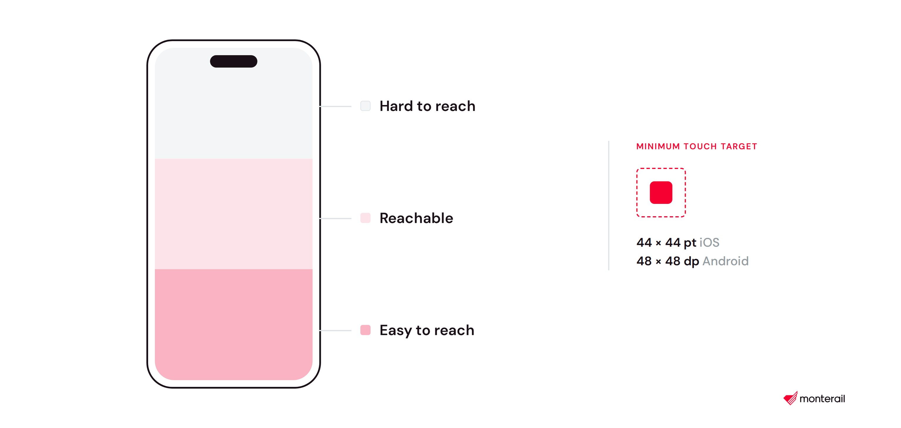
Touch target sizing. Apple recommends a minimum tappable area of around 44 by 44 points, and Google recommends a minimum of 48 by 48 density-independent pixels, both set to account for the size of an average fingertip rather than a mouse pointer.
Thumb zone design. On a one-handed phone, the bottom third of the screen is easiest to reach with a thumb, which is why primary navigation and key actions are increasingly placed at the bottom rather than the top.
Platform divergence. iOS and Android differ on basic interaction patterns, from how a user navigates back to how tab bars and system gestures behave, and a design that ignores this feels wrong on whichever platform it wasn't built for.
Offline and low-connectivity states. A mobile app has to define what happens when a user loses signal mid-task, since phones move between wifi, cellular data, and no connection far more often than a desktop browser does.
Performance under constraint. Screens are designed with battery drain, data usage, and processing limits in mind, particularly on lower-end devices that make up a large share of the global Android market.
What Are the Benefits of Mobile App Design?
Access to device capabilities. Push notifications, offline storage, camera access, and biometric login are available to native apps in ways a mobile browser can't fully replicate.
Higher engagement. Users who install an app tend to return to it more often than users who bookmark a mobile site, largely because an app icon and push notifications keep the product visible on the home screen.
Better performance for complex tasks. Native apps handle animation, large datasets, and offline work more smoothly than a browser running the same functionality.
Platform-native trust. An interface that follows Apple's or Google's own conventions feels more familiar and trustworthy to users than one that reinvents basic navigation patterns.
Distribution through app stores. App Store and Google Play listings give a product visibility and discoverability that a website alone doesn't have, including ratings and reviews that influence new users.
What Are the Challenges and Trade-offs of Mobile App Design?
Two platforms, one budget. Building a fully native experience for both iOS and Android roughly doubles the design and development work compared to a single web product.
App store gatekeeping. Apple and Google can reject a submission for reasons unrelated to code quality, including design choices, and a rejection adds review time before a fix can even be resubmitted.
Update friction. Unlike a website, which updates the moment new code ships, a native app update depends on users downloading it, so older versions of the interface can stay in circulation for months.
Small screen, big feature set. Fitting a product's full functionality into a few inches of screen space forces harder prioritization decisions than a desktop or responsive web layout requires.
Device fragmentation. Especially on Android, apps have to work across a wide range of screen sizes, hardware capabilities, and OS versions still in active use.
Testing overhead. A design that looks correct in Figma still needs to be verified on real devices, since touch behavior, screen glare, and performance vary in ways a design tool can't fully simulate.
Mobile App Design vs. Responsive Web Design: Which Fits?
Factor | Mobile App | Responsive Website |
|---|---|---|
Installation | Downloaded from an app store | Opened directly in a browser, no install |
Device access | Push notifications, offline storage, camera, biometrics | Limited, depends on browser capabilities |
Update process | User has to download each update | Updates live the moment new code ships |
Development cost | Higher, especially for two native platforms | Lower, one codebase serves every device |
Discoverability | App store search and rankings | Search engines and shared links |
Best suited for | Frequent use, offline needs, device-feature dependence | Occasional use, broad reach, fast iteration |
FAQ About Mobile App Design
Need expert help with Mobile App Design?
Monterail builds custom software solutions that leverage the latest technologies. Let's discuss how we can help with your project.
GET IN TOUCHGET IN TOUCH