The New Default. Your hub for building smart, fast, and sustainable AI software
Design System
Maintained collection of design tokens, reusable UI components, and documentation that a team uses to build consistent products across every screen and platform. It functions as a single source of truth for designers and developers, ensuring that a given button, color, or spacing rule is not redefined independently across different parts of a product.
What Is a Design System?
A design system is the set of resources a team uses to design and build a product consistently. It comprises design tokens (the smallest building blocks, such as color values, type scales, and spacing units), a library of reusable components built from those tokens, and documentation explaining how and when to use each one.
The term is often confused with two narrower concepts it actually contains. A style guide is a static visual reference, typically a document or brand deck showing colors and fonts, with no working code behind it. A component library is the coded set of buttons, forms, and cards a design system produces. A design system includes both of these, along with the tokens that connect them and the governance that keeps design and code from drifting apart over time.
Why Are Product Teams Investing in Design Systems?
Strategic Advantage: A design system lets a growing product team ship consistent screens without every designer rebuilding the same button, dropdown, or form field from scratch.
The Problem It Solves: It eliminates the drift that happens naturally as a product grows, where the same component ends up looking and behaving slightly differently across different screens because nobody was working from the same source.
How Does a Design System Work?
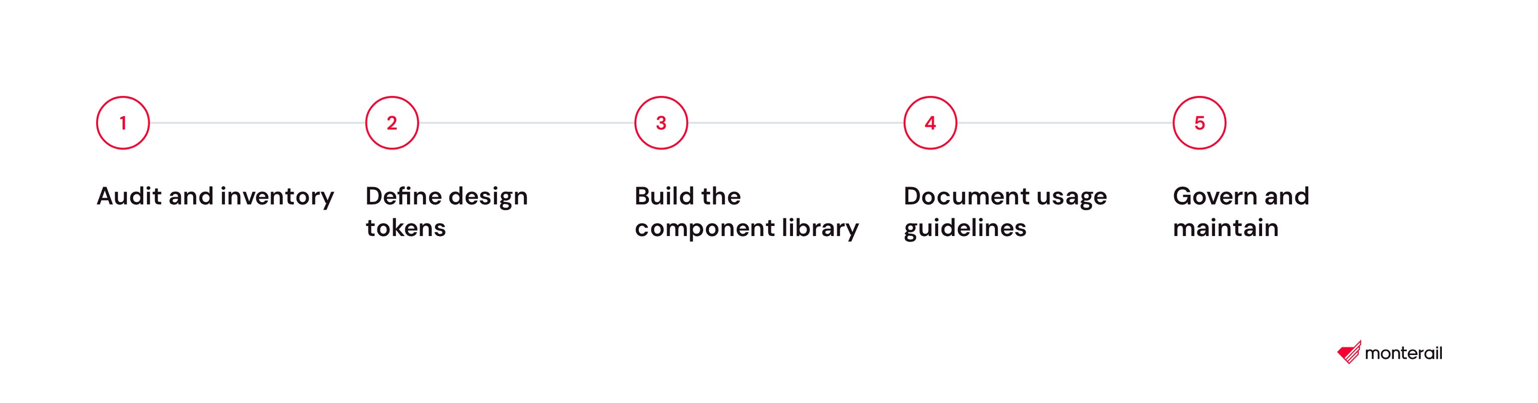
Building a design system begins with an audit of what already exists and continues as an ongoing process of maintenance.
Audit and inventory. The team catalogs the UI patterns already in use across the product, identifying which components are duplicated, inconsistent, or missing documentation entirely.
Define design tokens. Colors, typography, spacing, and other primitive values are named and centralized as design tokens, so that a single change to a token updates every component that uses it instead of requiring hundreds of manual edits.
Build the component library. Reusable components such as buttons, forms, and cards are designed in a tool such as Figma, then coded to match, and are typically maintained and previewed in a tool such as Storybook.
Document usage guidelines. Each component is documented with its variants, its appropriate use cases, and its accessibility requirements, so that teams do not have to guess or consult the original designer..
Govern and maintain. A dedicated team or a rotating group of owners reviews proposed changes, deprecates outdated patterns, and keeps the system from drifting out of sync with the product it supports.
Which Tools Support Design Systems?
Design and tokens: Figma remains the standard tool for building and sharing components across a team. Used alongside the Tokens Studio plugin and the Design Tokens Community Group format hosted at W3C, which reached its first stable version in October 2025, it allows design tokens to move between design tools and code without manual translation.
Code and documentation: Storybook and Zeroheight are widely used to preview coded components and document how each one should be used.
Token pipelines: Style Dictionary, an open-source tool originally built at Amazon, transforms a single set of token files into platform-specific code for web, iOS, and Android.
Public references: Google's Material Design, IBM's Carbon Design System, Atlassian Design System, and Shopify's Polaris are established, publicly documented design systems that many teams study before building their own.
What Are the Key Characteristics of a Design System?
A single source of truth. Design tokens define values such as color and spacing once, and every component pulls from that same source instead of duplicating the values independently.
Reusable components. Interface pieces are built once, tested once, and reused across every screen that needs them, rather than redesigned and recoded each time.
Documentation. Every component includes guidance on when to use it, its variants, and its accessibility requirements, not just what it looks like.
Versioning. The system is versioned the same way software is, so updates roll out deliberately instead of silently breaking screens that depend on an older version.
Cross-platform consistency. The same tokens generate consistent values across web, iOS, and Android, so a brand's colors and spacing stay aligned even when the underlying code is completely different per platform.
What Are the Benefits of a Design System?
Faster design and development. Teams assemble screens from existing, tested components instead of designing and coding each element from scratch.
Consistency across products. The same components look and behave the same way everywhere they're used, which is difficult to guarantee once more than a couple of designers or teams are involved.
Easier onboarding. New designers and engineers learn one shared system instead of reverse-engineering each product's own undocumented conventions.
Lower long-term maintenance cost. Fixing a bug or updating a style happens once, in the source component, instead of being patched separately everywhere it was copied.
A stronger accessibility baseline. Accessibility requirements get built into a component once and are inherited automatically everywhere that component is used.
What Are the Challenges and Trade-offs of a Design System?
Upfront investment. Auditing existing patterns, defining tokens, and building the first version of a component library takes real time before the system starts paying for itself.
Adoption resistance. A design system only helps if teams actually build with it instead of designing around it, and getting that adoption often takes more effort than building the system itself.
Governance overhead. Someone has to own decisions about what gets added, what gets deprecated, and how conflicting requests from different teams get resolved.
Design-to-code drift. If the design files and the coded components fall out of sync, the system stops functioning as a single source of truth and becomes just another thing to maintain.
Over-engineering risk. Building components and flexibility for use cases that don't exist yet can slow a team down rather than speed it up.
Scaling across brands. A design system built around one product's needs doesn't always flex cleanly when a company adds a second brand or product line with different requirements.
Design System vs. Style Guide: Which Handles What?
Factor | Design System | Style Guide |
|---|---|---|
What it is | Design tokens, coded components, documentation, and governance | A static visual reference document |
Where it lives | Figma libraries plus a coded component library, such as Storybook | A PDF, wiki page, or brand deck |
Kept in sync with code | Yes, that's the point of having one | No, it's a reference only |
Scope | Colors, typography, spacing, components, interaction rules, accessibility | Usually colors, typography, and logo usage |
Who maintains it | A dedicated team or rotating owners | Often created once and rarely updated |
FAQ About Design Systems
Related Terms
Need expert help with Design System?
Monterail builds custom software solutions that leverage the latest technologies. Let's discuss how we can help with your project.
GET IN TOUCHGET IN TOUCH