The New Default. Your hub for building smart, fast, and sustainable AI software

Table of Contents
The growing number of data viz libraries out there proves how important visualizations are for the whole Web, and that's pretty exciting!
Most applications rely on data visualization in some way. Whether it's dashboards, admin panels, performance tracking, or analytics features, visualizing data and presenting it to end-users is a critical functionality. Companies build strategies around the charts and numbers they see, often using them to make crucial business decisions.
For JavaScript developers, the ability to visualize data is just as valuable as creating interactive web pages, especially since the two often go hand in hand. As JavaScript continues to dominate the data visualization realm, the market offers an ever-growing selection of libraries for creating beautiful, functional charts.
How to Choose the Right JavaScript Data Visualization Library
For our internal purposes, we needed to better understand when to use them and why. We picked eighteen JavaScript graph visualization libraries that are currently the most popular or interesting for building digital products and started a little study to see which one would work best for our projects.
To understand which data visualization library would work best for your projects, there are a number of factors to consider:
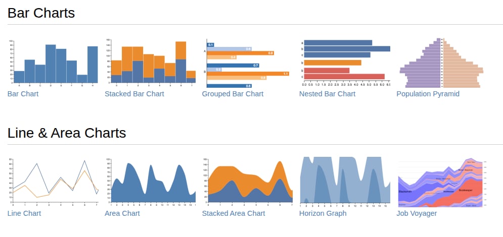
What kind of charts do I want to build? Pie charts, maps, lines, bars?
Some libraries support only a handful of types. Make sure you know which ones you need first.
How large is the dataset?
The rendering technology matters significantly for performance.
SVG-based libraries work well for smaller to medium datasets (under 10,000 elements), as each element is a unique node in the DOM tree, offering flexibility and easy interactivity.
Canvas-based libraries provide better performance for larger datasets through direct pixel manipulation.
WebGL-based libraries (like Apache ECharts) excel with very large datasets. They can maintain 58 FPS with 50,000+ data points where Canvas drops to 22 FPS and SVG becomes unusable. For datasets exceeding 10,000 elements, Canvas or WebGL are necessary to maintain smooth performance.
Is the app used for web, mobile, or both?
Some libraries are better at responsiveness, while a few others have their own React Native versions like Victory.
What’s the browser support for a given library?
Check your browser market share to figure this out.
Which JavaScript framework do you use?
Framework integration matters for developer experience and performance.
React developers should consider framework-specific libraries like Recharts (24K+ stars, excellent TypeScript support) or use wrappers for universal libraries.
Vue and Angular work well with most libraries through wrappers. Framework-agnostic options like Chart.js, D3.js, and ECharts integrate with any framework but may require more manual setup.
What kind of customization of the look and feel do you need?
If you need some advanced animations, for example, you should take that into consideration, too.
D3.js offers maximum customization but requires more effort, while Chart.js and ApexCharts provide beautiful defaults with moderate customization options for faster implementation.
Do you need TypeScript support?
In 2025, TypeScript has become essential for many development teams. Modern libraries like Recharts, Highcharts, and amCharts offer excellent TypeScript definitions or are built with TypeScript.
If your project uses TypeScript, verify that your chosen library has strong type definitions to avoid runtime errors and improve developer experience.
Is the library actively maintained?
Check the library's GitHub activity, release frequency, and community size. Popular libraries like Chart.js (2.5M+ weekly npm downloads) and D3.js have large communities for troubleshooting.
Active maintenance ensures bug fixes, security updates, and compatibility with modern browsers and frameworks.
When to Use a Data Visualization Library VS Building from Scratch
Use a library when:
You need standard charts with common features (tooltips, legends, axes)
The project requires multiple chart types
Time-to-market is important
You want built-in animations and responsive behavior
Build from scratch when:
Your charts are highly custom and unique to your product
Existing libraries can't accommodate your specific requirements
The visualization is a core differentiator of your product
For SVG-based custom charts, modern frameworks like Vue.js and React make the development process more manageable. However, Canvas-based custom visualizations require handling all interactivity logic yourself, which is why we generally recommend building from scratch only when it's essential to your product.
To see a real-life example of a data visualization app we built, check out Packet Analyzer.
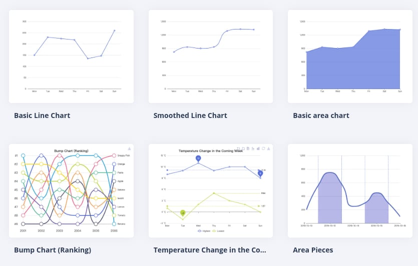
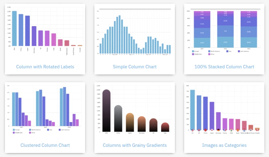
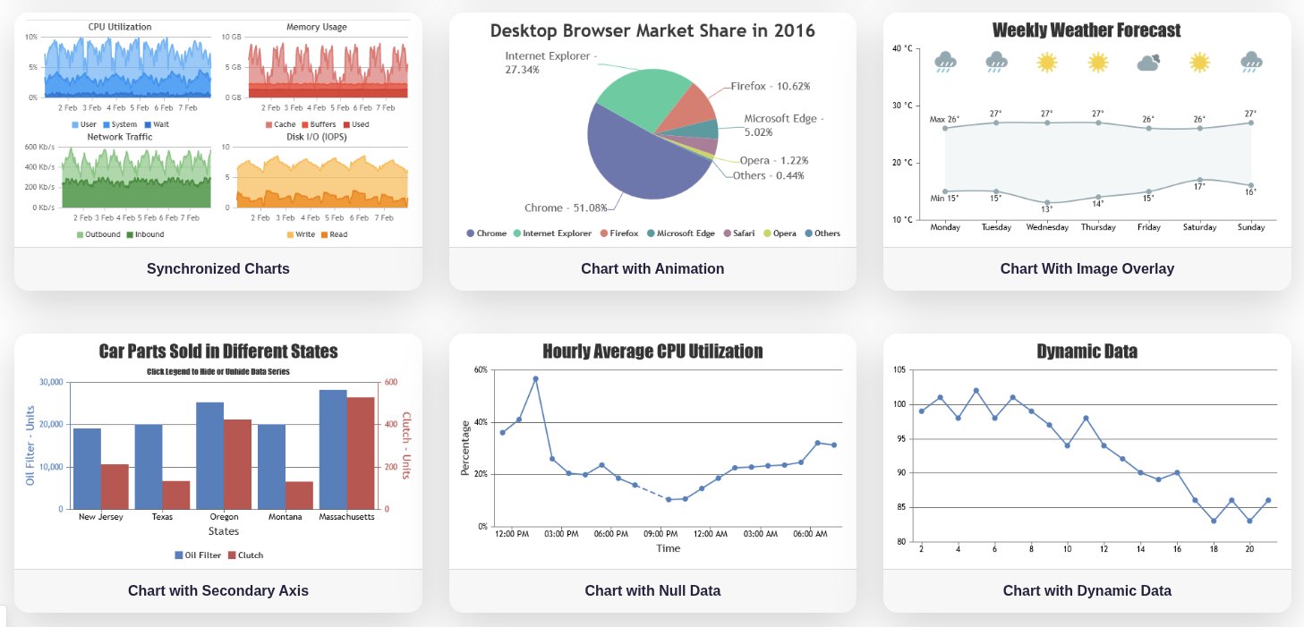
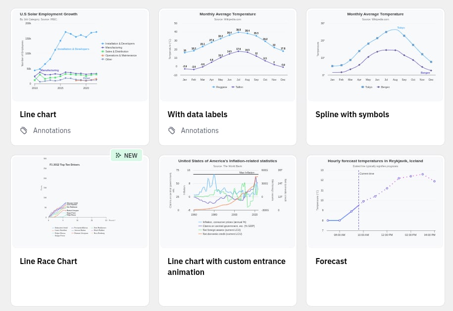
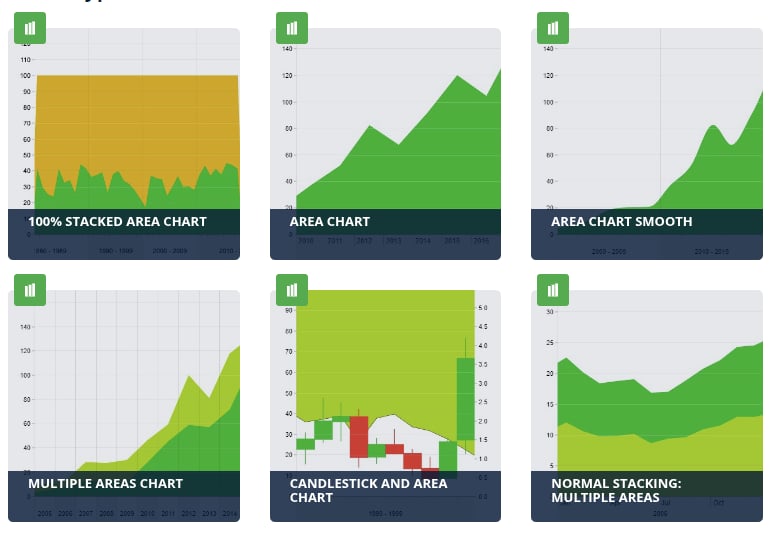
15 Top Javascript Data Visualization Libraries To Try
If you've answered the questions above and understand your project's requirements, you'll find your perfect match among the dozens of libraries available today.
In this list I focused on time-tested libraries. All of these have been around long enough to handle common use cases and edge cases, saving you from reinventing the wheel.
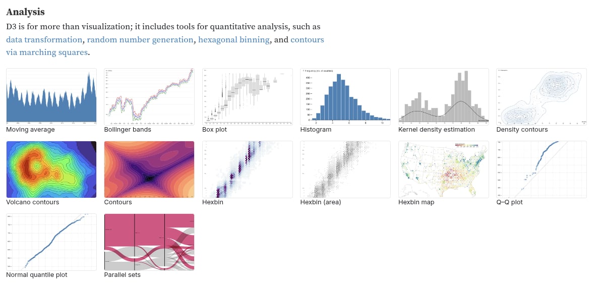
D3.js - The Industry-Standard Toolkit for Custom Visualizations
GitHub Stars: 112,000
D3 is one of the most popular JS libraries not just for data visualization, but also animations, data analysis, geo, and data utilities. It uses HTML, SVG, and CSS. Now maintained by Observable, D3 positions itself as "the JavaScript library for bespoke data visualization," emphasizing maximum flexibility for custom, data-driven graphics.
Everything you can probably think of can be done with this library, but it comes with its downsides. It has a steep learning curve, though documentation has improved significantly at d3js.org with better structure and examples. The comprehensive API and low-level control make it powerful but more complex than higher-level alternatives.
Much of the API exposes direct access to the DOM, which can conflict with React's virtual DOM. However, modern integration patterns are well-documented: use non-DOM modules (d3-scale, d3-array, d3-interpolate) directly in JSX, and for DOM-manipulating modules (d3-selection, d3-axis), attach a ref and call D3 in a useEffect hook. Similar approaches work for Vue and Svelte.
Links:
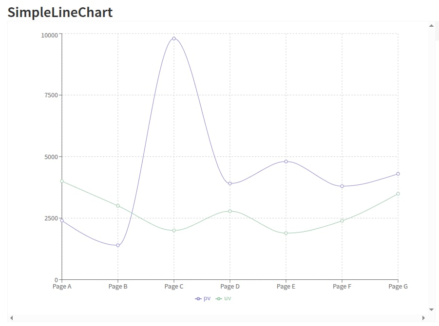
Recharts - Declarative React Charts Made Simple
GitHub Stars: 26,000
A data visualization library built specifically for React developers. Recharts uses D3 under the hood but exposes clean, declarative components that feel native to React. It renders SVG elements to create beautiful, interactive charts with excellent documentation and a gentle learning curve.
Charts are highly customizable with built-in tools like legends, tooltips, and labels. Performance is strong for moderate datasets and standard use cases - perfect for dashboards, admin panels, and internal tools. For extremely large datasets or highly dynamic visualizations with frequent updates, you may need additional optimizations. Strong TypeScript support makes it a solid choice for TypeScript projects.
One caveat: the project has 470+ open issues on GitHub, so community support can be inconsistent. However, active maintenance continues with regular releases (v3.2.1 in September 2025).
Best suited for: React applications needing standard chart types (line, bar, area, pie) with clean integration and minimal setup.
Links:
Victory - The Go-To for React Native Cross-Platform Apps
GitHub Stars: 11,200
An ecosystem of composable, modular React components designed for both React and React Native. Maintained by Nearform (formerly Formidable Labs), Victory excels at building accessible, cross-platform data visualizations with consistent APIs across web and mobile.
Victory provides solid fundamentals with straightforward APIs for axes customization, labels, multiple datasets, and styling. The declarative approach makes it intuitive to build nice-looking charts with minimal code. Strong ARIA support ensures accessibility out of the box, making it ideal for teams prioritizing inclusive design.
Actively maintained (v37.3.6 in January 2025) with a stable, mature ecosystem. Perfect for cross-platform applications needing consistent chart behavior on web and React Native.
Links:
Chartkick - One-Line Chart Simplicity Across Languages
GitHub Stars: 1,200 (JavaScript library)
Chartkick is a wrapper library that lets you "create beautiful charts with one line of JavaScript." Rather than being a standalone charting solution, it provides a unified, simplified API over Chart.js, Google Charts, or Highcharts - you choose which one to use as the underlying engine.
The appeal is extreme simplicity, as one line is literally all you need to create a chart. Chartkick is available for Vue.js, React, Python, Ruby, Elixir, and Clojure, making it ideal for developers who want consistent charting syntax across different tech stacks.
Best for: Quick prototypes, simple charts, and teams working across multiple programming languages who want a consistent interface.
Links:
Flexmonster - Enterprise Pivot Tables for Large Datasets
A commercial JavaScript pivot table and charts component for web applications, including React, React Native, Vue, Angular, and more. Flexmonster is designed for enterprise use, handling up to 1GB of data with 1 million records seamlessly.
Key capabilities: Connects to multiple data sources (JSON/CSV, SQL databases, MongoDB, Elasticsearch, Microsoft Analysis Services), provides advanced data aggregation and filtering, and offers comprehensive customization options. The component combines pivot tables with integrated charting.
Pricing: Ranges from $0 (trial/free tier) to $799+ depending on license type (Single Corporate, SaaS, OEM). License terms were updated effective January 2025. While pricing is higher than alternatives, it's designed for teams needing robust data analysis capabilities with large datasets.
Best for: Enterprise applications requiring pivot table functionality with extensive data sources and advanced analysis features.
Links:
WebDataRocks - Free Pivot Tables for Small Projects
A completely free JavaScript pivot table component compatible with React, Vue, Angular, and other frameworks. Created by the team behind Flexmonster as a no-cost option for smaller projects, WebDataRocks offers data aggregation, sorting, and filtering capabilities for web-based reporting.
Key features: Works with CSV and JSON data formats, provides essential pivot table functionality, and integrates easily with modern frameworks. Completely free with no licensing fees.
Limitations: Data size limited to 1MB, supports only CSV/JSON (no database connections), and lacks the advanced features of its commercial sibling Flexmonster. For teams needing more than 1MB of data or database connectivity, a migration path to Flexmonster exists.
Best for: Small to medium projects with limited data needs, prototypes, internal tools, and teams with no budget for pivot table components.
Links:
ApexCharts - Beautiful Interactive Charts with Minimal Effort
GitHub Stars: 14,900
A modern, MIT-licensed SVG charting library with excellent framework integrations for React, Vue, and Angular. ApexCharts delivers polished, responsive charts out of the box with comprehensive documentation and over 100 sample implementations. The library excels at interactive features like zooming, panning, scrolling, and informative annotations.
ApexCharts supports a dozen+ chart types including mixed charts that combine different visualizations on a single canvas. It's ideal for dashboards and monitoring applications with real-time data updates. However, as an SVG-based library, performance degrades with datasets beyond a few thousand data points - stick to Canvas or WebGL alternatives for larger datasets.
The balance of beautiful defaults, ease of use, and strong interactivity makes ApexCharts a solid choice when you need attractive charts quickly without extensive customization work.
Works with React, Vue.js, Angular, plain JavaScript.
Links:
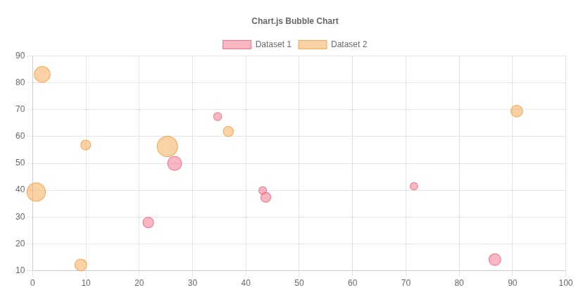
Chart.js - Simple, Flexible, and Massively Popular
GitHub Stars: 66,600 | npm Downloads: 5M+ weekly
Chart.js is the most popular JavaScript charting library, with more weekly downloads than any competitor. It's lightweight, using HTML5 Canvas for responsive charts that handle large datasets efficiently. You can easily mix and match chart types to combine different datasets on a single canvas.
Chart.js now offers 8 core chart types (with extensions bringing the total to 16, including financial charts), supports excellent responsiveness, and remains highly beginner-friendly. Version 4.0+ added tree-shaking for smaller bundles, better TypeScript support, and improved customization. Perfect for developers who want beautiful charts quickly without sacrificing flexibility.
Links:
Apache ECharts - The Enterprise-Grade Powerhouse for Large Datasets
GitHub Stars: 64,700
Originally created by Baidu, now maintained by the Apache Software Foundation, ECharts is a free, powerful JavaScript visualization library optimized for massive datasets. It's exceptionally well-documented in English and handles 10 million data points in real-time through progressive rendering and stream loading techniques.
ECharts offers 20+ chart types with flexible rendering options: Canvas (default for efficiency), SVG, or WebGL for 3D visualizations and extreme performance. The library automatically chooses the best rendering mode based on data size. It uses TypedArray for memory-efficient large dataset handling and supports full customization with accessibility features built in.
Version 6.0.0 (July 2025) continues the project's strong momentum. If you need to visualize large datasets with enterprise-grade reliability, ECharts is your best bet.
Links:
Nivo - Beautiful, Responsive Charts Out of the Box
GitHub Stars: 13,800
Nivo is a beautiful React charting library built on top of D3, offering rich, supercharged components for data visualization. Released in 2017 and actively maintained (v0.99.0 in May 2025), Nivo has built a thriving community around its customizability and responsive design.
The library offers three rendering options (Canvas, SVG, HTML), smooth motion/transitions via react-spring, server-side rendering support, and comprehensive theming capabilities. The documentation at nivo.rocks is exceptional with an interactive playground and configurable demos. It's a high-level library that prioritizes beautiful defaults and ease of use over low-level custom visualizations.
Links:
amCharts - Premium Design Meets Performance
GitHub stars: 1,200 (v4) | 412 (v5)
A premium charting library known for exceptionally beautiful design that sets it apart visually. amCharts lists Apple, Amazon, and NASA among its prominent clients. Now in version 5 (released October 2025), amCharts switched to Canvas rendering for significantly better performance while maintaining its signature aesthetics. The core library is only 400KB and offers full TypeScript support.
amCharts 5 is remarkably fast to implement - developers report getting proof-of-concept dashboards with multiple charts running in under 5 minutes. The library includes comprehensive chart types (bar, line, pie, heatmaps, Sankey, treemaps) plus geographical maps.
Licensing: Free version available with a small backlink. Commercial licenses start at $90-$180 per website. The price includes all chart types, excellent documentation, and responsive customer support (averaging under 3 hours). Best for teams prioritizing visual polish and willing to invest in a commercial solution.
Links:
CanvasJS - High-Performance Commercial Charts
A commercial Canvas-based charting library known for exceptional performance claims. CanvasJS markets itself as "10x faster" than SVG libraries and handles 100,000+ data points smoothly - users report rendering 100k points in just a few hundred milliseconds. The library includes 30+ chart types with responsive design across devices and browsers.
Strengths: Outstanding performance for large datasets, easy API with low learning curve, excellent documentation with live examples, and four default themes. Client list includes Apple, Bosch, Siemens, HP, and Microsoft.
Limitations: Some chart types are missing (network charts, sparklines, gauges require workarounds). Pricing is not transparent and users report it's higher than expected. Customer support quality receives mixed reviews.
Licensing: Free for non-commercial use. Commercial licenses required for business use (pricing available on request). Best for teams prioritizing raw performance with large datasets and willing to invest in a commercial solution.
Links:
Highcharts - The Trusted Choice for Enterprise Applications
GitHub Stars: 12,300
A mature, feature-rich charting library trusted by 80+ of the world's top 100 companies. Built on SVG with Canvas/WebGL support for performance, Highcharts offers a comprehensive ecosystem including stock charts, maps, Gantt charts, and timeline visualizations. The codebase is now 76% TypeScript with excellent type definitions and IDE auto-completion.
Highcharts excels at ease of use with smooth learning curves, extensive documentation, and a WYSIWYG chart editor for non-developers. The WebGL-powered boost module handles millions of data points efficiently. Recent additions include Highcharts GPT for creating visualizations with natural language prompts and improved React integration.
In addition, you can use SVG and/or shape generators along with it to make your visual elements more effective.
It's free for personal, non-profit, and school projects, but you need to apply for a license. Commercial licenses can get pretty costly. While the price point is higher than open-source alternatives, enterprise users value the comprehensive features, reliability, and support.
Links:
ZoomCharts - Premium Multi-Touch Interactive Exploration
A commercial JavaScript charts library positioning itself as the "world's most interactive" charting solution. ZoomCharts specializes in data exploration through custom-built multi-touch gestures and intuitive interactions optimized for touchscreen devices, tablets, and mobile platforms.
Key strengths: Canvas-based rendering for performance (claims up to 20x faster than SVG competitors), handles large datasets efficiently, custom multi-touch interaction layer, extensive API for customization, and multiple chart types (Time Chart, Net Chart, Geo Chart, Pie Chart, Face Chart). The focus is on enabling users to drill down, zoom, pan, and explore data naturally.
Best for: Enterprise dashboards and reporting applications where data exploration and multi-touch interactivity are critical differentiators, especially for touch-enabled devices.
Links:
Vega - A Declarative Visualization Grammar
GitHub Stars: 11,700
Developed by the UW Interactive Data Lab, Vega is a visualization grammar - a declarative format for creating interactive visualizations using JSON specifications. Rather than writing imperative code, you describe what you want to visualize, and Vega determines how to render it using Canvas or SVG.
The declarative approach makes Vega accessible to non-developers and enables rapid data exploration. Vega-Lite, the higher-level companion grammar, provides even more concise syntax for common visualizations. Both compile to the same rendering engine, so you can start with Vega-Lite and transition to full Vega for advanced customization.
Built on D3 principles but with less syntax weight, Vega offers similar power in a more structured format. Python bindings (Altair) make it popular in data science workflows. Version 6.0.0 (March 2025) continues active development. Open-source and free - ideal for teams wanting grammar-based visualization without learning D3's imperative API.
Links:
The Right JavaScript Data Visualization For Your Project
Whether you’re a small business or a large enterprise, creating highly interactive charts or managing large datasets - there’s a Javascript data visualization library out there that is sure to satisfy your needs.
Having the right tools can make all the difference. I hope this list will help you create beautiful visualizations and charts for your future projects. If none of these libraries fits your project, check out more on Best Of JS.
Good luck with your project!

Hubert Białęcki
Head of Technology at Monterail
As Monterail’s Head of Technology, Hubert brings a unique blend of technical expertise and strategic leadership to drive innovation and organizational growth. A graduate of Wrocław University of Science and Technology, Hubert has carved an impressive career path from JavaScript developer to technology executive, demonstrating both technical mastery and exceptional leadership capabilities. He excels at understanding complex organizational dynamics and implementing strategic changes that enhance team performance and company development.
)

)