The New Default. Your hub for building smart, fast, and sustainable AI software
In October 2018 I was invited to give a talk at the fifth Future of Design meetup, called The Beauty of Data. My talk was called “Crafting a story in data visualization”.
I talked with a few interesting people since then and acquired more knowledge on the subject that I felt was worth sharing.
Let’s get to it, then.
First, there is data. Then there is data analysis and, finally, data visualization or representation.
Somewhere along the way, data becomes information and information can be misleading. Data is honest, simple, and true. Information is infused with someone’s point of view, and may be biased by someone else’s decision to show only certain parts of data and say: “This is important.”
Information turns into knowledge and creates insights that can be used to make all kinds of business decisions. And today all companies, big and small, pursue at least some semblance of being data-driven. What if we, as data scientists, data visualization experts, designers, present data biased by our own views? That may lead to wrong decisions, poorly allocated funds, and misleading forecasts. That’s a huge responsibility.
What’s the problem with data?
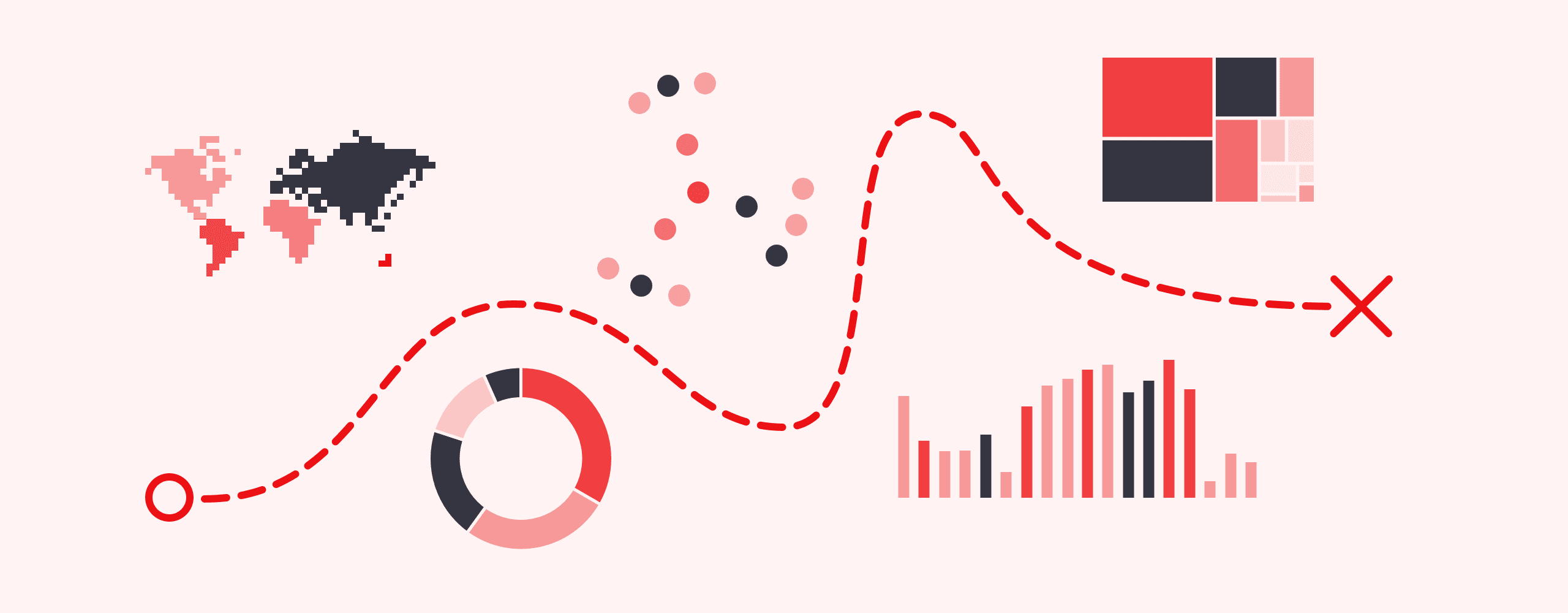
Data is everywhere. And in a corporate environment, where a lot of data is collected and processed, data visualizations are a must. The quality of those, however, is lacking most of the time. If you ever had to endure a never-ending report packed with tables, graphs, and the like, you probably have a pretty good idea of what I’m talking about.
There are many facets to this particular problem, but one that interests me the most, is that there’s rarely any storytelling in what we do.
We draft these reports because that’s what’s required or to back up some decision, and we do them the same, over and over again.
The same goes for applications with data and data visualizations. Their cardinal sin is that they too often show all the data there is, with no hierarchy or structure.
Let’s remember: Information is power. And how we present that information to others, is—also—a form of power. If a chart or a diagram doesn’t help you explain the subject matter, why use it at all?
What we observe in the real world very often fails to take the basics into account:
why (context)
for whom (audience)
how (space and type)
We have the tools to do anything
Just as data increasingly pervades every area of our lives, the possibilities what we can do with that data are becoming seemingly inexhaustible. We have a broad range of open source and commercial tools at our disposal that we can use to present data in an elegant and meaningful way.
The prospect of learning R, Python, or Scala from scratch can seem gruesome at first, but there are courses online that make the task approachable. We can quickly learn the basics of programming, cleaning data, data manipulation, probability and statistics, machine learning, and data visualization.
Want to understand data visualizations better? Go to DataViz Project.
Don’t know where to get data sets to train? Fret no more, Google DataSets are here.
More of a spatial kind of person? Mapbox Studio offer tons of avenues for beautifully visualizing spatial information.
These are, naturally, not the only tools out there to obtain and clarify data sets, to visualize, to report, to present data, etc.
And people DO awesome things with data
Open Pinterest and type Data Visualization. I dare you. The sheer number of incredible visualizations is simply stunning. Those are beautiful images and most of them offer some kind of knowledge that can quickly produce valuable, penetrating insights.
What people can create starting with an Excel spreadsheet is beyond magic. It’s pure beauty.
BUT.
All too often it’s all style and no substance and you can’t really read anything, unless you have a high-resolution printer and a magnifying glass. The purpose of data visualization is to influence its recipients. We collect, process, and analyze data to extract information. What we do with that information is crucial.
The key objective of data visualizations is to provide context to a decision-making process.
How to approach data with design?
There are always at least a few ways to visualize a data set and choosing which one to use is ultimately a design choice. You start with raw values and by choosing a line graph over a bar graph you decide what you want to emphasize.
You need to know who your audience is and what you want to evoke in them. With data presented in an approachable, meaningful way, they will eventually get to insights on their own and that’s the beauty of it. You can’t force it. Want to see some nice examples?
Many dimensions
As I said, you can always communicate data in many ways. In an example from VOXs analysis of a Bloomberg transcript of the hearing of Ford and Kavanaugh, the message could be “Ford answered all of the questions, while Kavanaugh didn’t answer almost a half”. And it would be a factual message. But adding a time dimension brings something deeper to the table, the readers can see the difference on their own (I admit that colors play a big role here, also).
Similar, although not as elegant as the straightforward solution that was used by Umbel when visualizing the first Trump/Clinton Presidential Debate.
not everything at once
Most of the time you can show the data on some kind of a bar graph, and it will be a decent visualization. The readers will see everything at once, getting the overview of the whole picture. But if you want to elicit some emotion or thought, it’s good to dose information a bit, as David McCandless from Information is Beautiful did. He starts this tree graph with a small—yet legible—tile showing infamous $1Trillion and readers can slowly scan next tiles building their own associations and insights. Important is the fact that readers cannot see the end of the graph, leaving space for a surprise.
Likewise Ferdio—a data visualisation studio—used a movie format and a piece of paper to illustrate The Rule of Halves for International Diabetes Federation (IDF).
everything at once (but in order)
What do you do, when you want to meaningfully visualize “Every Tax Cut and Tax Increase in the House G.O.P. Bill and What It Would Cost”, as New York Times did? Given the emotional baggage attached to the subject it was no easy feat, but the NYT has done a masterful job of it, showing all the tax cuts and increases on one screen and adding subtle animations to highlight the connections between different sections of the piece.
controls
Sometimes a data set is so big, and the audience so diverse, that the best design decision is to give control to the reader, as Carlo Zapponi and Vasundhara Parakh did for the WorldShapin project. It’s a lovely little application where one can “compare countries through their shape”. The premise is really simple — a reader can choose countries and compare them against the “world shape”. Plus additional information and a bonus for draggable time management.
Information is Beautiful created an interactive visualization illustrating the “contagiousness of microbes and pathogens”. It started as a static graphic, but now readers have all kinds of filters at their disposal, can change the X and Y axis’ values and hover over the names of the microbes, to know more. But if that’s too many options, one can choose one of four stories to follow, which are basically interactive slides highlighting different sections of the graph.
And that brings me to the most important part:
the narrative
Let’s get back—if only for a moment—to the fact that data visualizations have a specific purpose. They are a very useful tool for conveying information to their recipients.
When you need to make financial decisions every day, you’re probably interested in trends, want to see change over time, and look for outliers. Well-analyzed and visualized data is very powerful and you want the visualization as objective, impartial as possible.
Sometimes, data visualization is used in a narrative to influence the behavior of a group of people. And using a medically-themed example will serve us best here.
Canadian studio—Form+Function—was approached by Canadian Cancer Society to create an online platform for “learning about the impact of cancer and making positive lifestyle changes to mitigate the risk of developing it”.
As you can probably imagine, it was a little intimidating for the studio when they saw just how much data in various tables they had to deal with. They could have easily gone with delivering it in the form of an interactive website with lots of charts, but FF approached it differently. They used the data to create a story. Instead of showing a lot of charts about the risks of getting and dying of cancer, they asked the users to reveal a little information about themselves and used that to calculate the average risk of getting cancer. And the underlying data is always available to sift through.
Be aware, however, that such an approach far transcends the pure “data visualization” realm. This is crafting a story using data and information. Creating a narrative tailored to the person interacting with the website.
But in this case it definitely worked. 92.7% of people who visited the website declared themselves willing to make a lifestyle change to reduce their risk of cancer.
What does it mean to you?
Know your audience, find the context, and only then move to the execution. It’s always tempting to do something new and shiny, I know. But if you can’t draw immediate conclusions after only a couple of few seconds looking at the visualization—then something's off. Maybe it’s the data itself? Or maybe it’s the presentation.
Collecting, processing, and presenting data is a responsibility. Whatever you do, use your power wisely.
On January 23rd we’re hosting a webinar (in Polish) about data visualization. It’s free and I hope that my insights and examples will help you present your data more efficiently. If you ever had to endure a never-ending report packed with tables, graphs, you probably don’t want to miss this one.
Love beautiful products? We do, too.
Work with us and make sure that the vision you carry in your head will become reality.
Talk to our team and build a product you and your users will want to use.
)
Paweł Hawrylak
Product Designer