
Nowadays, you can build a working healthtech product in days. AI prototyping works wonders in delivering a tangible product, which is both impressive and a little dangerous. What AI cannot do is close the distance between a product that ships and a product that produces a clinical outcome. In 2026, that distance is widening because the tools compress the time it takes to build an interface without compressing the time it takes to understand the patient, the clinical workflow, or the regulations the product must comply with.
In this article, I cover seven design decisions that determine whether a HealthTech product works for real users in real clinical conditions. It’s based on my HealthTech Playbook conversation with the Head of Design & Business Analysis at Monterail, Krzysztof Kaiser, about building AI-enhanced healthtech products. We discussed interface design for non-average users, UX research, onboarding trust, friction that serves the clinical outcome, accessibility and cognitive load, localization, and invisible AI. Each draws on products Monterail has shipped across connected medical devices, wearables, remote monitoring platforms, and patient-facing apps.
Executive Summary
AI prototyping tools have driven the cost of building a health app close to zero. What they do not supply is domain knowledge: who the actual users are, what clinical outcome the product is accountable for, and what each design decision signals to someone under real health stress. Most digital health products fail for three related reasons. The assumptions built into the design collapse against real users, clinical workflows, and complex regulatory review. The sections below map where those assumptions break down, with examples from HealthTech products Monterail has built, and what it takes to close the gap before it becomes a compliance finding, a retention collapse, or a failed procurement review.
Why Do Most Health Apps Fail Even With Faster Prototyping?
Faster prototyping seems like the answer to preventing app failure. Yet the numbers tell a different story. More than 350,000 health apps are available globally, according to the IQVIA Institute. Most stall or disappear within months of launch. In one of the largest independent measurements of real-world use, a panel study of mental health apps found a median 30-day retention of just 3.3%. Those numbers predate the current wave of AI prototyping tools, and they are likely to get worse.
Most health apps fail because faster prototyping shortens the time teams spend understanding the user, not the time they spend building screens. AI tools compress the time between idea and prototype without compressing the time needed to understand the user, the clinical context, or the regulatory environment. Teams that once took three months to reach a testable prototype now take three weeks. The speed is real. The risk is that it shortens the window for the exact decisions that determine whether a product survives contact with patients.
The stakes are clinical, not cosmetic. Studies estimate that 30 to 50% of transplant patients do not follow their prescribed immunosuppression regimen, and that graft loss is around seven times more likely in non-adherent patients. How can we expect people to regularly use a wellness app when the stakes are much lower than their lives? Digital health products exist in part to address adherence problems at that severity. When they fail, the cost is a clinical outcome, measured in graft loss or missed doses.
The market has already registered the gap. Patient openness to health AI is sliding even as teams ship faster, a trust problem I unpacked in one of my articles. The design decisions below are where that trust is earned back.
Why Does AI-Generated UI Fail Healthcare App Users?
According to Krzysztof Kaiser, UI fails healthcare app users because it is built for an average user, and there is no average patient. Most AI generators default to Material Design, Apple's Human Interface Guidelines, or Tailwind. These visual languages are tuned for the widest possible range of products and users. The thing is, HealthTech serves none of those averages. A single product might have to work for a 25-year-old avoiding the social stigma of a medical device and a 75-year-old who has never paired a Bluetooth device. Sometimes the user is a clinician with 12 minutes per patient, and for a transplant patient managing immunosuppression at 6am, sleep-deprived and hoping the app makes the day simpler.
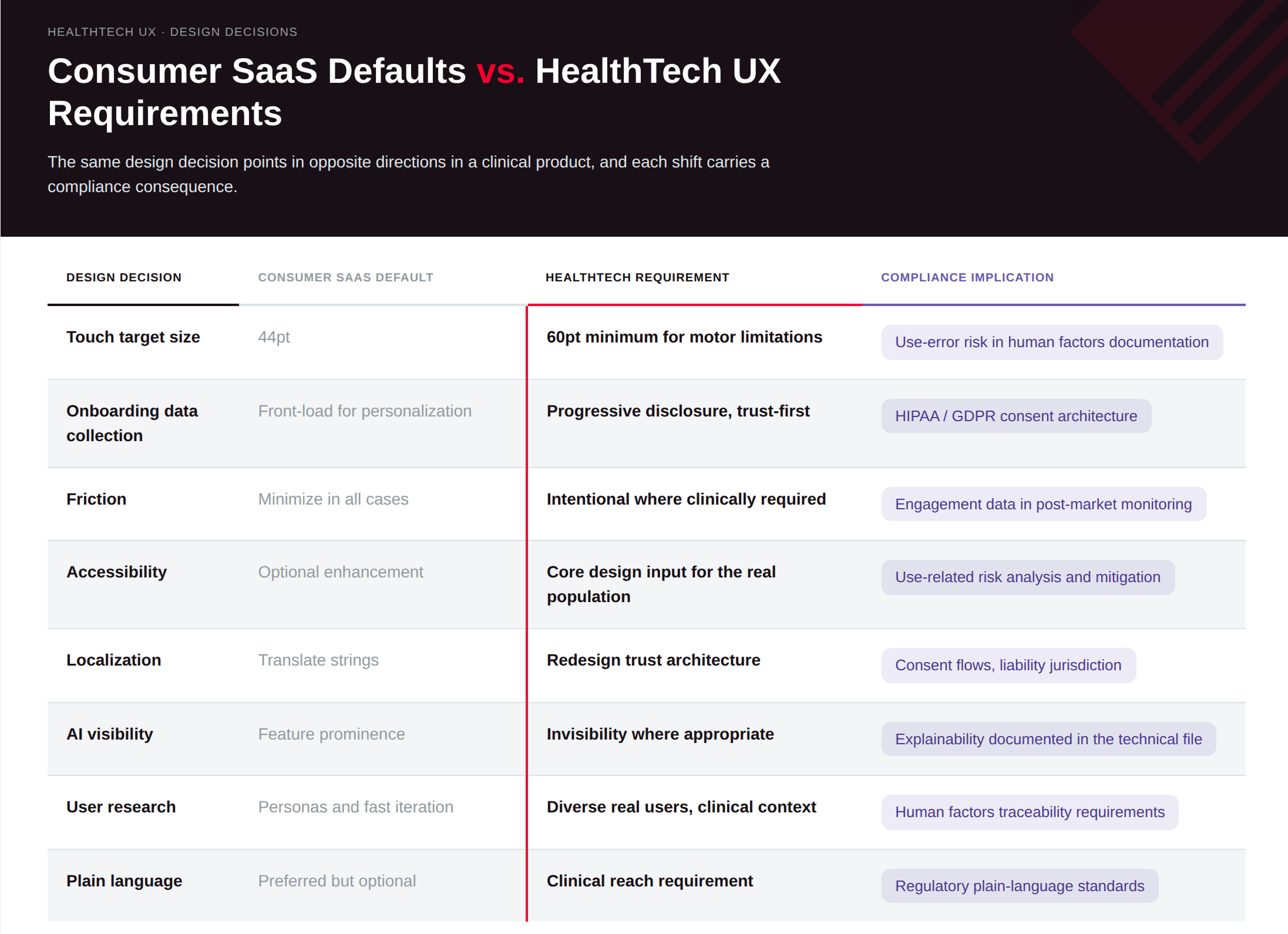
The measurements bear this out. The standard mobile touch target is 44 points; for users with motor limitations or reduced dexterity, research points to roughly 60 points as the functional minimum for equivalent accuracy. That difference matters for the older and motor-impaired users many HealthTech products are built for. AI tools won’t make that decision for you. A 2023 systematic review in JMIR compiled 27 design guidelines for older adults, spanning navigation, visual design, cognitive load, and interaction, that standard mobile patterns routinely miss. None of it appears in a Tailwind template.
Speed makes this harder to catch. AI-generated UI produces polished screens quickly, and polished screens create false confidence. Product teams see the prototype and mistake visual completeness for clinical fitness. The demo looks finished, and the patient still struggles.
Where a “good-looking” screen becomes a compliance problem
This has a regulatory edge. Human factors and usability engineering sit inside FDA design-control requirements, governed by IEC 62366-1 and the FDA's human factors guidance. As of February 2, 2026, the FDA's Quality Management System Regulation incorporates ISO 13485:2016 by reference, and design validation under that regime is where usability evidence lives. The change has consequences for your IoMT architecture. The FDA expects that work done early, done iteratively, and traced to use-related risk. A screen that looks right but produces use-error risk becomes a documentation problem that surfaces in submission review, well beyond the UX team.
What Does Good UX Research for Healthcare Apps Require?
Good HealthTech UX research requires knowing which questions to ask before any tool, AI or otherwise, can help answer them. AI has compressed the synthesis layer: transcript clustering, pattern detection across support tickets, and affinity grouping now take an hour instead of a day. That is real value. The bottleneck has moved upstream: question framing, which users represent clinical reality.
Synthetic personas cannot replace diverse real users, and in healthcare that gap is both a UX risk and a clinical one. Caroline Criado Perez's book Invisible Women documents a specific version of this problem in medicine: for decades, clinical research treated the male body as the default. Women were excluded from many drug trials until the 1990s, so dosing, side effects, and the described symptoms of conditions like heart attack were calibrated to male physiology, and women remain far more likely to be misdiagnosed as a result.
An AI UI generator inherits the same kind of skew through the same mechanism. It learns from a corpus of existing interfaces and the assumptions built into them, so if that corpus encodes a default user, the generator reproduces the default and treats everyone outside it, older adults, low-literacy users, people with motor limitations, as edge cases rather than as the population.
Case study: Eargo, one interface for two opposite users
Eargo shows what upstream research changes. When Eargo came to Monterail, the brief was to improve the UX of an invisible hearing aid. Two weeks of research before touching a single screen changed the direction of the whole project.
Eargo had built something new: an invisible hearing aid that let younger users avoid the social stigma of a visible medical device. Research revealed the real design challenge. The product had to serve two users with almost opposite needs through one interface. On one side, a 25-year-old for whom the device had to be invisible and the app effortless, and on the other, a 75-year-old first-time hearing aid user with limited technical literacy, possible motor limitations, and no experience pairing Bluetooth medical devices.
Those two users need different things from the same product, and the brief gave no signal on which to prioritize. Without research, the team would have optimized for one and failed the other. The outcome was a custom device-pairing flow built outside the standard iOS and Android patterns and calibrated for the older group, handling the ultrasonic and Bluetooth pairing that first-time users found hardest. The team designed the personalization features specifically to reduce customer support load.
How Does Onboarding Design Affect Patient Retention?
Onboarding design decides whether patients stay long enough for a HealthTech product to produce a clinical outcome, and most HealthTech onboarding is built to extract data instead of building trust. The common pattern: an app asks for age, weight, medical history, wearable integrations, and intimate health details in the first session, then tells the user the results will be ready in 15 days. From a product architecture view, that makes sense, because the system needs the data. From the patient's view, it says, “Give us everything now, and we will give you something eventually.”
The consequence is measurable. A scoping review of lifestyle and mental health apps found that user experience problems, apps that are difficult or confusing to use, were among the most consistently identified reasons people abandon them, ahead of weak content or a weak value proposition. The same adherence dynamic that drives graft loss in transplant patients applies here: people under health-related stress do not reliably log daily data for a product that has not yet earned their trust.
Every data request in onboarding carries a trust cost. Progressive disclosure answers it: ask only for what is needed now, explain why, show what the user gets in return, and deliver value before asking for more. WHOOP's onboarding sets clear expectations for its calibration period, telling the user they will get a first recovery score within a few days and a full personalized baseline after 30 recorded recoveries, so the value roadmap is explicit before the data pays off. That is trust-first onboarding in practice.
Five questions every HealthTech onboarding should answer before requesting user data:
Why are you asking for this?
What will I get in return?
When will I see value?
How will my data be used?
What should I do next?
Consent architecture carries the same regulatory weight. Built wrong at MVP stage, it creates HIPAA and GDPR exposure that is among the most operationally risky things to fix once real patient data is in production. Multi-institution deployments need consent flows that hold up under health-system legal review, which is a higher bar than conversion optimization.
When Should a Health App Add Friction Instead of Removing It?
Friction helps in a health app when it is the mechanism that produces the clinical outcome, and removing it breaks the outcome. Standard UX practice reduces friction. It makes interactions fast, cuts steps, and keeps users moving. In consumer software, that is almost always right. In HealthTech, applying it without the clinical context produces products that look good on an engagement dashboard but fail to do the most important thing: improve patient health.
The GLP-1 telehealth market shows the difference. Two or three years ago, some platforms issued a semaglutide prescription in a single session. Platforms that now require users to return, log symptoms, and speak with a clinician before renewal added that step deliberately. That friction is the mechanism for responsible clinical oversight. Removing it makes the app easier to use and the health outcome worse.
How Should Healthcare App UX Design Treat Accessibility and Cognitive Load?
HealthTech must design for users' standard patterns leave behind because low health literacy and accessibility needs are common in many populations. Roughly half of American adults struggle to find and use health information effectively, and users with low health literacy are less likely to adopt digital health tools and more likely to abandon them. Plain language determines clinical reach. Medically accurate copy and usable copy are different things.
Cognitive load and motor ability set the rest of the bar. For the older and motor-impaired users many HealthTech products serve, standard mobile patterns routinely fall short, and a device-setup or pairing step can turn into a support-ticket problem until it is rebuilt. High support-ticket volume at a setup step is use-error data. FDA human factors guidance expects manufacturers to document use-related risk and show that the interface mitigates it, and support tickets are evidence regulators can examine. Treating accessibility as a research and design input from the start is cheaper than meeting it as a use-error finding after launch.
Is Localization More Than Translation in Healthcare Apps?
HealthTech localization means redesigning how a product communicates trust, autonomy, and care inside a specific cultural and health-system context. Translation handles the language, and the architecture underneath still needs its own work. I’ve seen many times how teams mix those terms and adjust localization only on the surface, such as translating strings, changing date formats, reviewing legal copy, and shipping. In HealthTech, your UX depends on the healthcare system you’re entering. Localization reaches consent flows, how risk is communicated, who the product actually addresses, and whether the trust relationship sits with the individual patient or with the health system that referred them.
I’ve noticed the US and the Netherlands make a good point. In US healthcare culture, patient autonomy is a foundational value: the patient decides, and the product presents options. In Dutch healthcare culture, patients tend to follow the system: the doctor recommends, and the patient complies. The same interface logic produces different adoption outcomes in each context, and neither approach is wrong. They call for different design decisions.
In parts of Asia and the Middle East, health decisions are family-mediated. A family member may buy a product, the patient may use it, and a clinician may evaluate it. One onboarding flow cannot serve three trust relationships unless it is designed for each.
When Monterail worked on Elvie Trainer, the product needed different communication strategies across European, US, and Arab markets, covering vocabulary, who the primary buyer is, what role the provider plays in the purchase, and which medical language is culturally acceptable. These are product strategy decisions with UX consequences at every layer.
In the US alone, about 68 million people speak a language other than English at home, and roughly 30 million have limited English proficiency, according to the US Census Bureau. The Plain Writing Act of 2010 requires federal agencies to communicate clearly, which directly affects health documentation. Localization belongs in product strategy from the first sprint, well before a market-entry phase would force it.
What Is Invisible AI, and Why Does It Work Best in Healthcare App?
Invisible AI is the design principle that AI in a HealthTech product should serve users without asking them to interact with, manage, or even notice it. It is the standard the strongest HealthTech products are converging on. Most AI products launched between 2022 and 2024 were built to be experienced as AI: dashboards surfaced insights, badges announced AI features, recommendation panels explained their own logic. For the users HealthTech most needs to reach so older adults, people managing chronic illness, and people with cognitive or motor limitations, it added cognitive load instead of removing it. The technology asked users to serve it rather than serving them.
The design question that matters is what the user actually needs, and whether the AI has to be visible for them to receive it.
Case study: Camino, a smart walker that hides its intelligence
Camino makes the case. Its smart walker carries sensors in the frame that track the user's gait continuously across 22 gait metrics, detect improvement or decline in therapy, and send that data to the physiotherapist. The clinical intelligence was built to run in the background from the start, informing care decisions the team makes weeks later. The end user has a walker. Early in the engagement, there were concepts for a companion app with patient-facing dashboards, and user interviews closed them down. People didn’t want a dashboard; they wanted a seat, a fold-out rest point for when they got tired.
The dashboard concept deviated from the product's own logic, and the research corrected it. The walker's most advanced capability stayed where it belonged, out of the patient's way. The clinician receives the data, and the patient just uses the walker.
Case study: Elvie Trainer, biofeedback without a dashboard
Elvie Trainer shows the same principle on a connected device Monterail helped build. The pelvic floor trainer is an FDA-registered, medical-grade silicone device that pairs with a mobile app, and Monterail developed the native iOS and Android apps. During a session, the user follows short guided exercises and watches a gem move on screen as they contract. Underneath, the device's biofeedback distinguishes a correct lift from bearing down, the common mistake that can make the problem worse, and its contraction detection has been validated against clinical dynamometry at high accuracy. The user never manages a model. They get a five-minute exercise and a gem that responds. With around one in three women experiencing pelvic floor problems in their lifetime, keeping the intelligence in the background is what lets the exercise stay simple enough to do every day.
Invisible AI on the clinician side: ambient scribes
That call takes domain expertise: the judgment to remove a feature the product team believed users wanted, on evidence that they did not. Ambient scribes make the same point on the clinician side. Clinicians using DAX or Abridge do not think about AI during an encounter; they see the patient, and documentation happens in the background. A study in JAMA Network Open found ambulatory clinician burnout dropped from 51.9% to 38.8% after 30 days of ambient scribe use, because the technology got out of the way.
A HealthTech AI feature earns its place when it reduces user effort. When it instead requires the user to interact with the AI to get the benefit, the interaction model needs redesigning before submission.
What Must Be True for HealthTech UX to Produce Clinical Outcomes?
HealthTech UX produces clinical outcomes when three things hold: the design process is grounded in real user research, the compliance architecture is set before the first production write, and the team has enough domain expertise to recognize when a design assumption has to change. In practice, that means five conditions.
Research with the actual clinical population. Convenience sampling, meaning users who are easy to recruit, healthy, and technically comfortable, produces findings that do not transfer to the populations HealthTech serves. Research has to include users with the specific conditions, literacy levels, physical limitations, and cultural contexts the product will meet at scale.
Human factors evidence from day one. Under the FDA's Quality Management System Regulation, which incorporates ISO 13485:2016 by reference as of February 2, 2026, usability sits inside design controls and design validation, governed by IEC 62366-1. Teams that treat usability testing as a late-stage task find at submission that informal notes do not qualify and cannot be reconstructed after the fact.
Consent architecture that survives institutional review. A HIPAA Business Associate Agreement written for a single-institution pilot needs substantial rebuilding for multi-institution enterprise deployment, and rebuilding data flows after real patient data is in production is one of the riskiest activities in HealthTech development.
SaMD classification answered at sprint zero. Whether the software only manages data or performs a clinical function sets the regulatory path, the audit-logging requirements, the encryption standards, and the data-retention obligations. A misclassification discovered at month six forces a rebuild that touches everything already in production. See whether your product is a medical device.
Post-market monitoring ownership. Someone's job has to include watching whether the product still produces a clinical outcome, beyond confirming that it still runs. Engagement decay and adverse-event signals show up in support tickets before they reach formal reporting, and only if someone is looking.
Key Takeaways
AI prototyping tools compress the time to build a prototype while leaving the time it takes to understand the user untouched. That gap is where most HealthTech products fail, and faster tools make it harder to see.
Standard mobile conventions (touch targets, front-loaded onboarding, friction minimization) are built for average users in ideal conditions. HealthTech users are neither, so designing for the real population is a core requirement, not an accessibility add-on.
Onboarding is a trust contract with compliance consequences. Every data request costs trust before any value is delivered, and consent architecture built wrong at MVP stage is among the hardest things to fix once real patient data is in production.
Localization is a product strategy decision that reshapes consent flows, autonomy expectations, and medical vocabulary; translation handles only the words.
The most effective AI in HealthTech announces itself least. If a clinical AI feature needs the user to interact with the AI to get the benefit, the interaction model is wrong.
The Design Question to Ask Before Your Next Sprint
Speed in HealthTech is only worth something when the team moving fast knows who they are building for, what clinical outcome the product owns, and what its design decisions say to a user who is stressed, sick, or managing a condition they did not choose. Those questions do not get easier to answer as prototyping gets faster. They get easier to skip. The teams producing clinical outcomes in 2026 are the ones that have not skipped them.
)